Exploratory Data Analysis: Variations of Box Plots in R for Ozone Concentrations in New York City and Ozonopolis
May 26, 2013 19 Comments
Introduction
Last week, I wrote the first post in a series on exploratory data analysis (EDA). I began by calculating summary statistics on a univariate data set of ozone concentration in New York City in the built-in data set “airquality” in R. In particular, I talked about how to calculate those statistics when the data set has missing values. Today, I continue this series by creating box plots in R and showing different variations and extensions that can be added; be sure to examine the details of this post’s R code for some valuable details. I learned many of these tricks from Robert Kabacoff’s “R in Action” (2011). Robert also has a nice blog called Quick-R that I consult often.
Recall that I the “Ozone” vector in the data set “airquality” has missing values. Let’s remove those missing values first before constructing the box plots.
# abstract the raw data vector
ozone0 = airquality$Ozone

# remove the missing values
ozone = ozone0[!is.na(ozone)]
Box Plots – What They Represent
The simplest box plot can be obtained by using the basic settings in the boxplot() command. As usual, I use png() and dev.off() to print the image to a local folder on my computer.
png('INSERT YOUR DIRECTORY HERE/box plot ozone.png')
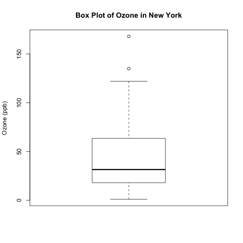
boxplot(ozone, ylab = 'Ozone (ppb)', main = 'Box Plot of Ozone in New York')
dev.off()
What do the different parts of this box plot mean?
- The top and bottom lines of the rectangle are the 3rd and 1st quartiles (Q3 and Q1), respectively. The length of the rectangle from top to bottom is the interquartile range (IQR).
- The line in the middle of the rectangle is the median (or the 2nd quartile, Q2).
- The top whisker denotes the maximum value or the 3rd quartile plus 1.5 times the interquartile range (Q3 + 1.5*IQR), whichever is smaller.
- The bottom whisker denotes either the minimum value or the 1st quartile minus 1.5 times the interquartile range (Q1 – 1.5*IQR), whichever is larger.
You can confirm some of these numbers by calculating the five-number summary with the summary() function.
*This following 5-number summary has been changed from a previous post. Please read my comment at the end of this post for an explanation on why this was done.
> summary(ozone)
Min.    1st Qu.     Median    Mean      3rd Qu.    Max.       NA's
1.00    18.00       31.50     42.13     63.25      168.00     37
In this example, the bottom whisker is the minimum value, 1. The maximum value (168.0) is not the top whisker because it is larger than Q3 + 1.5*IQR.
Q3 + 1.5*IQR = 63.25 + 1.5*(63.25 – 18.0) = 131.125 < 168.0
Parallel Box Plots for Comparing Different Populations
Box plots are useful for visually comparing the “centres” and “spreads” of multiple data sets. I used rgamma() to simulate a second data set called ozone2, and I used set.seed() to ensure its reproducibility; let’s pretend that it contains data for a very polluted city called Ozonopolis. (My choice of using the gamma distribution in simulating this second data set will become apparent in future posts on combining histograms and kernel density plots and quantile-quantile plots!)
# simulate ozone pollution data for Ozonopolis based on New York's ozone data
# set seed for you to replicate my random numbers for comparison
mean.ozone = mean(ozone)
var.ozone = var(ozone)

# obtain the sample size
n = length(ozone)

set.seed(1)
ozone2 = rgamma(n, shape = mean.ozone^2/var.ozone+3, scale = var.ozone/mean.ozone+3)
Here is the code for plotting the parallel box plots with the labels of the cities using the ‘names‘ option.
png('INSERT YOUR DIRECTORY PATH HERE/box plots ozone New York Ozonopolis.png')
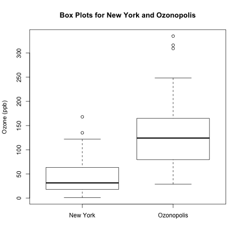
boxplot(ozone, ozone2, ylab = 'Ozone (ppb)', names = c('New York', 'Ozonopolis'), main = 'Box Plots for New York and Ozonopolis')
dev.off()
These box plots suggest that Ozonopolis has significantly more ozone than New York; not only is the centre higher for Ozonopolis, but the 2 IQRs (the 2 rectangles) do not overlap along the vertical axis, suggesting that the 2 population means differ beyond just random variation. To quantify this difference, you can use an independent 2-sample t-test, which I described in detail in a previous post regarding the discovery of argon by Lord Rayleigh and William Ramsay.
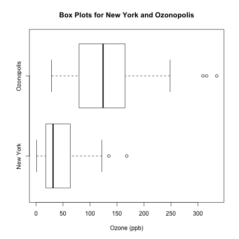
I prefer this above vertical orientation of the box plots, but it is possible to arrange them horizontally by specifying horizontal = T. Be sure to change ylab = ‘Ozone (ppb)’ to xlab = ‘Ozone (ppb)’.
boxplot(ozone, ozone2, xlab = 'Ozone (ppb)', names = c('New York', 'Ozonopolis'), main = 'Box Plots for New York and Ozonopolis', horizontal = T)
There is another way of specifying the axis labels in R, but it requires calling a separate function called axis(), and it requires different syntax for horizontal and vertical box plots.
boxplot(ozone, ozone2, ylab = 'Ozone (ppb)', xaxt = 'n', main = 'Box Plots for New York and Ozonopolis')
axis(1, at = c(1,2), labels = c('New York', 'Ozonopolis'))
xaxt = ‘n’ in boxplot() suppresses the x-axis labels that come with boxplot().
The first argument in axis(), “1“, specifies that the axis labels go on the bottom; see the documentation for further details.
Box Plots with Notches
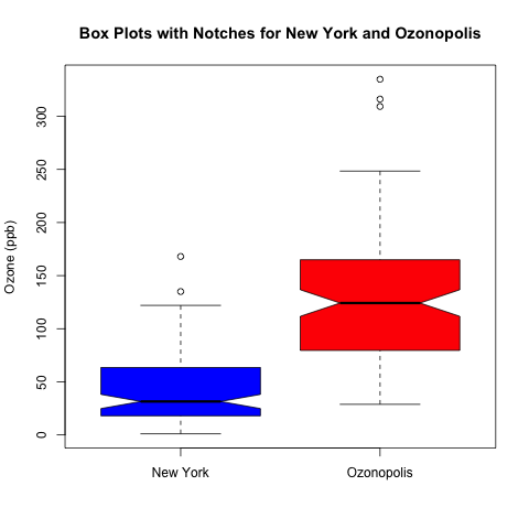
A nice addition to add to box plots is notches. According to Chambers et al. (Page 62, 1983), the 2 medians are significantly different with 95% confidence if the notches of 2 box plots do not overlap. Let’s plot the box plots with notches for our 2 cities’ ozone concentrations.
png('INSERT YOUR DIRECTORY PATH HERE/notched box plots ozone New York Ozonopolis.png')
boxplot(ozone, ozone2, notch = T, ylab = 'Ozone (ppb)', names = c('New York', 'Ozonopolis'), main = 'Box Plots with Notches for New York and Ozonopolis', col = c('blue', 'red'))
dev.off()
As you can see, the notches for the ozone concentrations in New York and Ozonopolis don’t overlap, so there is strong evidence to suggest that their medians are significantly different.
Stay Tuned for More!
Box plots are simple but effective tools for data visualization. In a future post, I will talk about kernel density plots, and I will introduce a type of box plot that incorporates a kernel density plot.
References
- Chambers, J. M., Cleveland, W. S., Kleiner, B. and Tukey, P. A. (1983) Graphical Methods for Data Analysis. Wadsworth & Brooks/Cole.
- Kabacoff, Robert. R in Action. Manning Publications Co., 2011.


Here is a reference you might be interested for more variation of the boxplot in additional to the violin plot you have mentioned.
Click to access boxplots.pdf
Cheers,
Thanks for this paper, Michael! Those box plots look very cool!
In a previous version of this post, the 5-number summary was calculated using summary(fivenum(ozone)). This resulted in a problem and a discrepancy.
– The problem is that the mean is wrong. summary(fivenum(ozone)) gives the mean as 56.4 when it is actually 42.13.
– The discrepancy arises from the difference between the 3rd quartiles of 2 different methods in R. summary(fivenum(ozone)) gives a 3rd quartile of 63.5, while summary(ozone) gives a 3rd quartile of 63.25.
summary() and fivenum() uses different methods for calculating quantiles that result in different 1st and 3rd quartiles when a data set is small and has an even sample size. Here is an example:
> w = 1:6
> fivenum(w)
[1] 1.0 2.0 3.5 5.0 6.0
> summary(w)
Min. 1st Qu. Median Mean 3rd Qu. Max.
1.00 2.25 3.50 3.50 4.75 6.00
To explain the discrepancy in short, fivenum() gives the average of the 2 “middle values” of the ordered data BELOW and EXCLUDING the median of the entire data set for computing the 1st quartile, while summary() uses quantile() to get sample quantile of order 0.25. (The parallel explanation applies to the 3rd quartile.)
I raised this question in a discussion in the LinkedIn group “R Programming” entitled “5-Number Summaries in R”, and I encourage you to read the discussion for more clarification. I thank Marco Biffino and Mukul Mehta for their contributions to that discussion.
I have changed this post so that it now uses summary() to get the correct mean and to be consistent with the post on descriptive statistics.
I thank David Maxwell and Allan Reese from the Centre for Environment, Fisheries and Aquaculture Science in Great Britain for noting and explaining these issues in personal emails with me.
Sorry, I’m confused. How to get ozone2?
Hello Wildful Robot,
Good for you for noticing this omission, and thank you for pointing it out! I have updated my blog post to explain how I simulated it.
Eric
I may be wrong, but is there any interpretation of the width of the boxplot.
I am new to the data analysis/statistics and still in the learning stage. So my question could be meaningless.
Hello Tridib,
No, there is no meaning to the width of the box plot along the axis that denotes the name of the data set.
Eric
Thanks a lot Eric for quick reply.
I have couple of questions. If you have time to reply or write a post in your blog on the following questions, that would be great.
1. How to handle lots of missing values in a very large dataset ?
2. How to sample a smaller data set from a very large dataset (e.g 204000 x 150) with lots of missing values ?
Thanks
Tridib
Hi Tridib,
1) You are not specific in what you mean by “handle”, so I presume that you mean to extend your question about box plots for missing values. Unfortunately, there is nothing that you can do to account for missing values in a box plot. It is worthwhile to note the number of missing values in any exploratory data analysis. In R, the summary() function will show the number of values coded as ‘NA’, which is the usual coding for missing values.
2) This is a good question. I am not an expert on missing data, so I am not the best person to answer this question; I welcome others to contribute their ideas!
I will definitely consider researching this issue and writing a blog post about it.
Reblogged this on RANDOM THOUGHTS and commented:
This is a nice blog by Eric Cai. Specially for those who are new to statistics/data analysis.
Thanks for re-blogging my post, duttatridib! I’m glad that you find my blog to be useful!
Reblogged this on nishant@analyst.
Thanks for this. BTW, mean.ozone and var.ozone are not defined here. They are defined in another post, but it may not be easy for readers to find.
Thanks for noting this omission, detaildevil. I have updated my post to define them!
I expended a while trying to figure out why the whiskers of my data set didn’t change with some values of range in the boxplot function. After a while (reading the documentation in r) I discovered that:
The top whisker does not really denotes the maximum value or the 3rd quartile plus 1.5 times the interquartile range (Q3 + 1.5*IQR), whichever is smaller.
But
The most extreme data point which is no more than range (in your example 1.5) times the interquartile range from the box. A value of zero causes the whiskers to extend to the data extremes.
This means, that if your vector (in the example, ozone) would not have any value equal to Q3 + 1.5*IQR, the whisker would extend to the immediately below value in your vector.
In the example,
Q3 + 1.5*IQR = 63.25 + 1.5*(63.25 – 18.0) = 131.125 < 168.0
If your vector does not have any 131 value, the whisker would extend to maybe 120 or 100 depending which is the immediately below value in your vector.
I hope it is more or less clear, and helpfull
Cheers
Hi there,
Using your code for ozone2, I get an error message as object n is not found. what should this be?
Thank!
Thanks for noticing this error, Anne. I’ve corrected my post to remove the missing values at the beginning and then obtain the length of the data vector before creating “ozone2”.
great, thanks Eric! Excellent site, thanks so much!
Thank you for your input, Anne!