Eric’s Enlightenment for Monday, June 1, 2015

  1. A comprehensive graphic of public perceptions about chemistry in the United Kingdom – compiled by the Royal Society of Chemistry.  (Hat Tip: Neil Smithers)
  2. Qing Ke et al. compiled a list of “sleeping beauties” in science – articles that were not appreciated at the time of publication and required much passage in time before becoming popular in the scientific community.  (Unfortunately, that original article is gated by subscription.)  As reported in Nature.com, “the longest sleeper in the top 15 is a statistics paper from Karl Pearson, entitled, ‘On lines and planes of closest fit to systems of points in space‘.  Published in Philosophical Magazine in 1901, this paper awoke only in 2002.”  Out of those top 15 sleeping beauties, 7 were in chemistry.  A full pre-published version of Ke et al.’s paper can be found on arXiv.
  3. What would the Earth’s stratospheric ozone layer look like if the Montreal Protocol was never enacted to ban halocarbon refrigerants, solvents, and aerosol-can propellants?  Using simulations, Martyn Chipperfield et al. “found that the Antarctic ozone hole would have grown by an additional 40% by 2013.”
  4. Jan Hoffman on new challenges in mental health for university students: “Anxiety has now surpassed depression as the most common mental health diagnosis among college students, though depression, too, is on the rise. More than half of students visiting campus clinics cite anxiety as a health concern, according to a recent study of more than 100,000 students nationwide by the Center for Collegiate Mental Health at Penn State.”
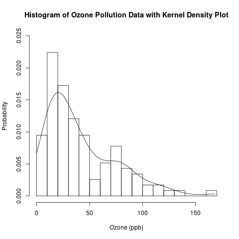
Exploratory Data Analysis: Combining Histograms and Density Plots to Examine the Distribution of the Ozone Pollution Data from New York in R

Introduction

This is a follow-up post to my recent introduction of histograms.  Previously, I presented the conceptual foundations of histograms and used a histogram to approximate the distribution of the “Ozone” data from the built-in data set “airquality” in R.  Today, I will examine this distribution in more detail by overlaying the histogram with parametric and non-parametric kernel density plots.  I will finally answer the question that I have asked (and hinted to answer) several times: Are the “Ozone” data normally distributed, or is another distribution more suitable?

histogram and kernel density plot

Read the rest of this post to learn how to combine histograms with density curves like this above plot!

This is another post in my continuing series on exploratory data analysis (EDA).  Previous posts in this series on EDA include

Read more of this post

Exploratory Data Analysis: Conceptual Foundations of Histograms – Illustrated with New York’s Ozone Pollution Data

Introduction

Continuing my recent series on exploratory data analysis (EDA), today’s post focuses on histograms, which are very useful plots for visualizing the distribution of a data set.  I will discuss how histograms are constructed and use histograms to assess the distribution of the “Ozone” data from the built-in “airquality” data set in R.  In a later post, I will assess the distribution of the “Ozone” data in greater depth by combining histograms with various types of density plots.

Previous posts in this series on EDA include

histogram

Read the rest of this post to learn how to construct a histogram and get the R code for producing the above plot!

Read more of this post

Exploratory Data Analysis – Kernel Density Estimation and Rug Plots in R on Ozone Data in New York and Ozonopolis

Update on July 15, 2013:

Thanks to Harlan Nelson for noting on AnalyticBridge that the ozone concentrations for both New York and Ozonopolis are non-negative quantities, so their kernel density plot should have non-negative support sets.  This has been corrected in this post by

– defining new variables called max.ozone and max.ozone2

– using the options “from = 0” and “to = max.ozone” or “to = max.ozone2” in the density() function when defining density.ozone and density.ozone2 in the R code.

Update on February 2, 2014:

Harlan also noted in the above comment that any truncated kernel density estimator (KDE) from density() in R does not integrate to 1 over its support set.  Thanks to Julian Richer Daily for suggesting on AnalyticBridge to scale any truncated kernel density estimator (KDE) from density() by its integral to get a KDE that integrates to 1 over its support set.  I have used my own function for trapezoidal integration to do so, and this has been added below.

I thank everyone for your patience while I took the time to write a post about numerical integration before posting this correction.  I was in the process of moving between jobs and cities when Harlan first brought this issue to my attention, and I had also been planning a major expansion of this blog since then.  I am glad that I have finally started a series on numerical integration to provide the conceptual background for the correction of this error, and I hope that they are helpful.  I recognize that this is a rather late correction, and I apologize for any confusion.

For the sake of brevity, this post has been created from the second half of a previous long post on kernel density estimation.  This second half focuses on constructing kernel density plots and rug plots in R.  The first half focused on the conceptual foundations of kernel density estimation.

Introduction

This post follows the recent introduction of the conceptual foundations of kernel density estimation.  It uses the “Ozone” data from the built-in “airquality” data set in R and the previously simulated ozone data for the fictitious city of “Ozonopolis” to illustrate how to construct kernel density plots in R.  It also introduces rug plots, shows how they can complement kernel density plots, and shows how to construct them in R.

This is another post in a recent series on exploratory data analysis, which has included posts on descriptive statistics, box plots, violin plots, the conceptual foundations of empirical cumulative distribution functions (CDFs), and how to plot empirical CDFs in R.

kernel density plot with rug plot ozone New York

Read the rest of this post to learn how to create the above combination of a kernel density plot and a rug plot!

Read more of this post

Exploratory Data Analysis: 2 Ways of Plotting Empirical Cumulative Distribution Functions in R

Introduction

Continuing my recent series on exploratory data analysis (EDA), and following up on the last post on the conceptual foundations of empirical cumulative distribution functions (CDFs), this post shows how to plot them in R.  (Previous posts in this series on EDA include descriptive statistics, box plots, kernel density estimation, and violin plots.)

I will plot empirical CDFs in 2 ways:

  1. using the built-in ecdf() and plot() functions in R
  2. calculating and plotting the cumulative probabilities against the ordered data

Continuing from the previous posts in this series on EDA, I will use the “Ozone” data from the built-in “airquality” data set in R.  Recall that this data set has missing values, and, just as before, this problem needs to be addressed when constructing plots of the empirical CDFs.

Recall the plot of the empirical CDF of random standard normal numbers in my earlier post on the conceptual foundations of empirical CDFs.  That plot will be compared to the plots of the empirical CDFs of the ozone data to check if they came from a normal distribution.

Read more of this post

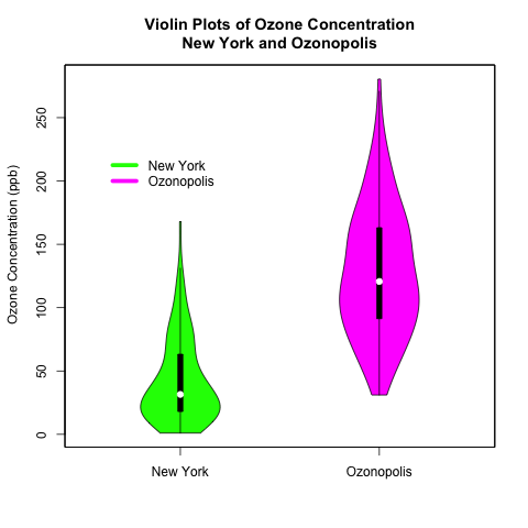
Exploratory Data Analysis: Combining Box Plots and Kernel Density Plots into Violin Plots for Ozone Pollution Data

Introduction

Recently, I began a series on exploratory data analysis (EDA), and I have written about descriptive statistics, box plots, and kernel density plots so far.  As previously mentioned in my post on box plots, there is a way to combine box plots and kernel density plots.  This combination results in violin plots, and I will show how to create them in R today.

Continuing from my previous posts on EDA, I will use 2 univariate data sets.  One is the “ozone” data vector that is part of the “airquality” data set that is built into R; this data set contains data on New York’s air pollution.  The other is a simulated data set of ozone pollution in a fictitious city called “Ozonopolis”.  It is important to remember that the ozone data from New York has missing values, and this has created complications that needed to be addressed in previous posts; missing values need to be addressed for violin plots, too, and in a different way than before.  

The vioplot() command in the “vioplot” package creates violin plots; the plotting options in this function are different and less versatile than other plotting functions that I have used in R.  Thus, I needed to be more creative with the plot(), title(), and axis() functions to create the plots that I want.  Read the details carefully to understand and benefit fully from the code.

violin plots

Read further to learn how to create these violin plots that combine box plots with kernel density plots!  Be careful – the syntax is more complicated than usual!

Read more of this post

Exploratory Data Analysis – Computing Descriptive Statistics in R for Data on Ozone Pollution in New York City

Introduction

This is the first of a series of posts on exploratory data analysis (EDA).  This post will calculate the common summary statistics of a univariate continuous data set – the data on ozone pollution in New York City that is part of the built-in “airquality” data set in R.  This is a particularly good data set to work with, since it has missing values – a common problem in many real data sets.  In later posts, I will continue this series by exploring other methods in EDA, including box plots and kernel density plots.

Read more of this post