Exploratory Data Analysis – All Blog Posts on The Chemical Statistician

This series of posts introduced various methods of exploratory data analysis, providing theoretical backgrounds and practical examples.  Fully commented and readily usable R scripts are available for all topics for you to copy and paste for your own analysis!  Most of these posts involve data visualization and plotting, and I include a lot of detail and comments on how to invoke specific plotting commands in R in these examples.

I will return to this blog post to add new links as I write more tutorials.

Useful R Functions for Exploring a Data Frame

The 5-Number Summary – Two Different Methods in R

Combining Histograms and Density Plots to Examine the Distribution of the Ozone Pollution Data from New York in R

Conceptual Foundations of Histograms – Illustrated with New York’s Ozone Pollution Data

Quantile-Quantile Plots for New York’s Ozone Pollution Data

Kernel Density Estimation and Rug Plots in R on Ozone Data in New York and Ozonopolis

2 Ways of Plotting Empirical Cumulative Distribution Functions in R

Conceptual Foundations of Empirical Cumulative Distribution Functions

Combining Box Plots and Kernel Density Plots into Violin Plots for Ozone Pollution Data

Kernel Density Estimation – Conceptual Foundations

Variations of Box Plots in R for Ozone Concentrations in New York City and Ozonopolis

Computing Descriptive Statistics in R for Data on Ozone Pollution in New York City

How to Get the Frequency Table of a Categorical Variable as a Data Frame in R

The advantages of using count() to get N-way frequency tables as data frames in R

Exploratory Data Analysis: Combining Box Plots and Kernel Density Plots into Violin Plots for Ozone Pollution Data

Introduction

Recently, I began a series on exploratory data analysis (EDA), and I have written about descriptive statistics, box plots, and kernel density plots so far.  As previously mentioned in my post on box plots, there is a way to combine box plots and kernel density plots.  This combination results in violin plots, and I will show how to create them in R today.

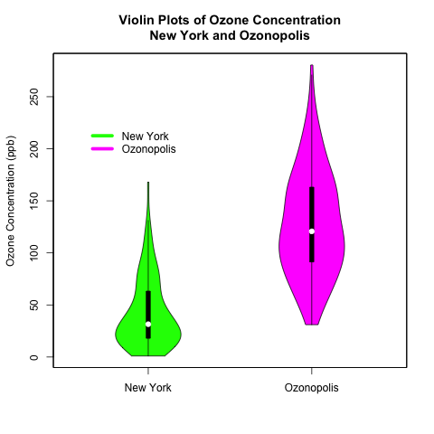
Continuing from my previous posts on EDA, I will use 2 univariate data sets.  One is the “ozone” data vector that is part of the “airquality” data set that is built into R; this data set contains data on New York’s air pollution.  The other is a simulated data set of ozone pollution in a fictitious city called “Ozonopolis”.  It is important to remember that the ozone data from New York has missing values, and this has created complications that needed to be addressed in previous posts; missing values need to be addressed for violin plots, too, and in a different way than before.  

The vioplot() command in the “vioplot” package creates violin plots; the plotting options in this function are different and less versatile than other plotting functions that I have used in R.  Thus, I needed to be more creative with the plot(), title(), and axis() functions to create the plots that I want.  Read the details carefully to understand and benefit fully from the code.

violin plots

Read further to learn how to create these violin plots that combine box plots with kernel density plots!  Be careful – the syntax is more complicated than usual!

Read more of this post

Exploratory Data Analysis: Variations of Box Plots in R for Ozone Concentrations in New York City and Ozonopolis

Introduction

Last week, I wrote the first post in a series on exploratory data analysis (EDA).  I began by calculating summary statistics on a univariate data set of ozone concentration in New York City in the built-in data set “airquality” in R.  In particular, I talked about how to calculate those statistics when the data set has missing values.  Today, I continue this series by creating box plots in R and showing different variations and extensions that can be added; be sure to examine the details of this post’s R code for some valuable details.  I learned many of these tricks from Robert Kabacoff’s “R in Action” (2011).  Robert also has a nice blog called Quick-R that I consult often.

Recall that I the “Ozone” vector in the data set “airquality” has missing values.  Let’s remove those missing values first before constructing the box plots.

# abstract the raw data vector
ozone0 = airquality$Ozone

# remove the missing values
ozone = ozone0[!is.na(ozone)] 

Box Plots – What They Represent

The simplest box plot can be obtained by using the basic settings in the boxplot() command.  As usual, I use png() and dev.off() to print the image to a local folder on my computer.

png('INSERT YOUR DIRECTORY HERE/box plot ozone.png')
boxplot(ozone, ylab = 'Ozone (ppb)', main = 'Box Plot of Ozone in New York')
dev.off()

box plot ozone

What do the different parts of this box plot mean?

Read more of this post

Discovering Argon with the 2-Sample t-Test

I learned about Lord Rayleigh’s discovery of argon in my 2nd-year analytical chemistry class while reading “Quantitative Chemical Analysis” by Daniel Harris.  (William Ramsay was also responsible for this discovery.)  This is one of my favourite stories in chemistry; it illustrates how diligence in measurement can lead to an elegant and surprising discovery.  I find no evidence that Rayleigh and Ramsay used statistics to confirm their findings; their paper was published 13 years before Gosset published about the t-test.  Thus, I will use a 2-sample t-test in R to confirm their result.

Lord Rayleigh                                    William Ramsay

Photos of Lord Rayleigh and William Ramsay

Source: Wikimedia Commons

Read more of this post