Exploratory Data Analysis – Kernel Density Estimation and Rug Plots in R on Ozone Data in New York and Ozonopolis

Update on July 15, 2013:

Thanks to Harlan Nelson for noting on AnalyticBridge that the ozone concentrations for both New York and Ozonopolis are non-negative quantities, so their kernel density plot should have non-negative support sets.  This has been corrected in this post by

– defining new variables called max.ozone and max.ozone2

– using the options “from = 0” and “to = max.ozone” or “to = max.ozone2” in the density() function when defining density.ozone and density.ozone2 in the R code.

Update on February 2, 2014:

Harlan also noted in the above comment that any truncated kernel density estimator (KDE) from density() in R does not integrate to 1 over its support set.  Thanks to Julian Richer Daily for suggesting on AnalyticBridge to scale any truncated kernel density estimator (KDE) from density() by its integral to get a KDE that integrates to 1 over its support set.  I have used my own function for trapezoidal integration to do so, and this has been added below.

I thank everyone for your patience while I took the time to write a post about numerical integration before posting this correction.  I was in the process of moving between jobs and cities when Harlan first brought this issue to my attention, and I had also been planning a major expansion of this blog since then.  I am glad that I have finally started a series on numerical integration to provide the conceptual background for the correction of this error, and I hope that they are helpful.  I recognize that this is a rather late correction, and I apologize for any confusion.

For the sake of brevity, this post has been created from the second half of a previous long post on kernel density estimation.  This second half focuses on constructing kernel density plots and rug plots in R.  The first half focused on the conceptual foundations of kernel density estimation.

Introduction

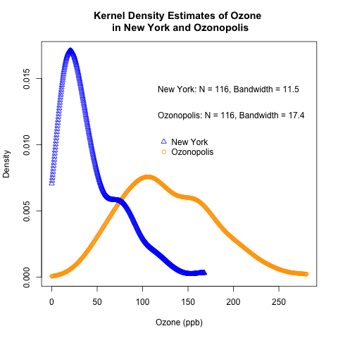
This post follows the recent introduction of the conceptual foundations of kernel density estimation.  It uses the “Ozone” data from the built-in “airquality” data set in R and the previously simulated ozone data for the fictitious city of “Ozonopolis” to illustrate how to construct kernel density plots in R.  It also introduces rug plots, shows how they can complement kernel density plots, and shows how to construct them in R.

This is another post in a recent series on exploratory data analysis, which has included posts on descriptive statistics, box plots, violin plots, the conceptual foundations of empirical cumulative distribution functions (CDFs), and how to plot empirical CDFs in R.

kernel density plot with rug plot ozone New York

Read the rest of this post to learn how to create the above combination of a kernel density plot and a rug plot!

Read more of this post

The Chemical Statistician: Syndication on R-Bloggers!

I am very pleased to announce that The Chemical Statistician has been syndicated by R-Bloggers!  I am grateful to be included in such a wonderful community of bloggers who share their passion about knowledge about R, and I hope that my posts are of use to its many readers.

Thank you, R-Bloggers!

My thanks to Tal Galili from R-Bloggers for visiting my blog and including me in his blog aggregator!  Tal has his own blog on R and statistics called the R-statistics blog.  Check it out!

Exploratory Data Analysis: 2 Ways of Plotting Empirical Cumulative Distribution Functions in R

Introduction

Continuing my recent series on exploratory data analysis (EDA), and following up on the last post on the conceptual foundations of empirical cumulative distribution functions (CDFs), this post shows how to plot them in R.  (Previous posts in this series on EDA include descriptive statistics, box plots, kernel density estimation, and violin plots.)

I will plot empirical CDFs in 2 ways:

  1. using the built-in ecdf() and plot() functions in R
  2. calculating and plotting the cumulative probabilities against the ordered data

Continuing from the previous posts in this series on EDA, I will use the “Ozone” data from the built-in “airquality” data set in R.  Recall that this data set has missing values, and, just as before, this problem needs to be addressed when constructing plots of the empirical CDFs.

Recall the plot of the empirical CDF of random standard normal numbers in my earlier post on the conceptual foundations of empirical CDFs.  That plot will be compared to the plots of the empirical CDFs of the ozone data to check if they came from a normal distribution.

Read more of this post

Exploratory Data Analysis: Conceptual Foundations of Empirical Cumulative Distribution Functions

Introduction

Continuing my recent series on exploratory data analysis (EDA), this post focuses on the conceptual foundations of empirical cumulative distribution functions (CDFs); in a separate post, I will show how to plot them in R.  (Previous posts in this series include descriptive statistics, box plots, kernel density estimation, and violin plots.)

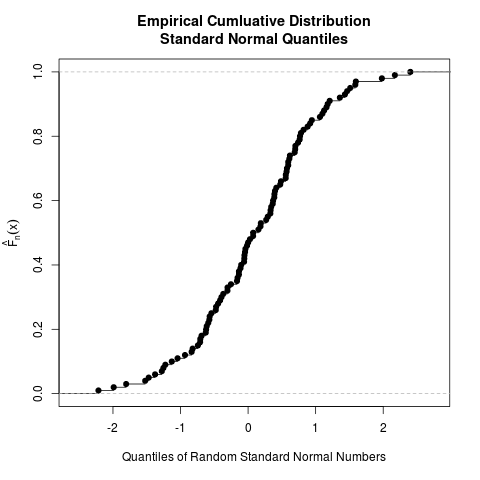
To give you a sense of what an empirical CDF looks like, here is an example created from 100 randomly generated numbers from the standard normal distribution.  The ecdf() function in R was used to generate this plot; the entire code is provided at the end of this post, but read my next post for more detail on how to generate plots of empirical CDFs in R.

ecdf standard normal

Read to rest of this post to learn what an empirical CDF is and how to produce the above plot!

Read more of this post

Exploratory Data Analysis: Combining Box Plots and Kernel Density Plots into Violin Plots for Ozone Pollution Data

Introduction

Recently, I began a series on exploratory data analysis (EDA), and I have written about descriptive statistics, box plots, and kernel density plots so far.  As previously mentioned in my post on box plots, there is a way to combine box plots and kernel density plots.  This combination results in violin plots, and I will show how to create them in R today.

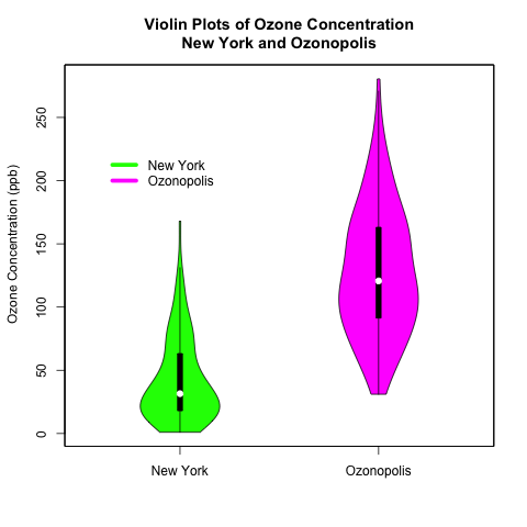
Continuing from my previous posts on EDA, I will use 2 univariate data sets.  One is the “ozone” data vector that is part of the “airquality” data set that is built into R; this data set contains data on New York’s air pollution.  The other is a simulated data set of ozone pollution in a fictitious city called “Ozonopolis”.  It is important to remember that the ozone data from New York has missing values, and this has created complications that needed to be addressed in previous posts; missing values need to be addressed for violin plots, too, and in a different way than before.  

The vioplot() command in the “vioplot” package creates violin plots; the plotting options in this function are different and less versatile than other plotting functions that I have used in R.  Thus, I needed to be more creative with the plot(), title(), and axis() functions to create the plots that I want.  Read the details carefully to understand and benefit fully from the code.

violin plots

Read further to learn how to create these violin plots that combine box plots with kernel density plots!  Be careful – the syntax is more complicated than usual!

Read more of this post

Opening Doors In Your Job Search With Statistics & Data Analysis – Guest Blogging on Simon Fraser University’s Career Services Informer

The following post was originally published on the Career Services Informer.

Who are the potential customers that a company needs to target in its marketing campaign for a new service? What factors cause defects in a manufacturer’s production process? What impact does a wage-subsidy program have on alleviating poverty in a low-income neighbourhood? Despite the lack of any suggestion about numbers or data in any of these questions, statistics is increasingly playing a bigger – if not the biggest – role in answering them. These are also problems your next employer may need you to adress. How will you tackle them?

sfu csi

The information economy of the 21st century demands us to adapt to its emphasis on extracting insight from data – and data are exploding in size and complexity in all industries. As you transition from the classroom to the workplace in a tough job market, becoming proficient in basic statistics and data analysis will give you an edge in fields that involve working with information. This applies especially to STEM (science, technology, engineering, and mathematics) and business, but it also applies to health care, governmental affairs, and the social sciences. Even fields like law and the arts are relying on data for making key decisions.

Read more of this post

Exploratory Data Analysis: Kernel Density Estimation – Conceptual Foundations

For the sake of brevity, this post has been created from the first half of a previous long post on kernel density estimation.  This first half focuses on the conceptual foundations of kernel density estimationThe second half will focus on constructing kernel density plots and rug plots in R.

Introduction

Recently, I began a series on exploratory data analysis; so far, I have written about computing descriptive statistics and creating box plots in R for a univariate data set with missing values.  Today, I will continue this series by introducing the underlying concepts of kernel density estimation, a useful non-parametric technique for visualizing the underlying distribution of a continuous variable.  In the follow-up post, I will show how to construct kernel density estimates and plot them in R.  I will also introduce rug plots and show how they can complement kernel density plots.


kernel density plot ozone


But first – read the rest of this post to learn the conceptual foundations of kernel density estimation.

Read more of this post

Presentation in Toronto on Friday, June 7, 2013: Discriminant Analysis – A Machine Learning Technique for Classification in JMP and SAS

Update: My presentation has been moved from 9:30 am to 10:50 am.  I have switched time slots with Justin Jia.  I will present from 10:50 – 11:20 am.

I will deliver a presentation entitled “Discriminant Analysis – A Machine Learning Technique for Classification in JMP and SAS” at the Toronto Area SAS Society (TASS) on Friday, June 7, 2013.  Discriminant analysis is a powerful technique for predicting categorical target variables, and it can be easily implemented in JMP and SAS.  I will give a gentle, intuitive, but not overly mathematical introduction to this technique that will be accessible to a wide audience of statisticians and analytics professionals from diverse backgrounds.

Eric Cai - Official Head Shot

Come to my next presentation at the Toronto Area SAS Society on Friday, June 7, 2013!

I have previously written about the educational and networking benefits of attending SAS user group events, which are completely free to attend.  Besides TASS, I have also attended the Toronto Data Mining Forum and the SAS Health User Group meetings.  I encourage you to even consider presenting at these meetings; check out my previous presentation on partial least squares regression.

You can find more information about the next meeting in this agenda, which also contains links to the registration web sites.  Note that there are 2 events – one in the morning, and one in the afternoon – so be sure to register for both if you wish to attend the entire day’s events.

Toronto Area SAS Society Meeting

Classic TASS: 9:00 am – 12:00 pm

Interfaces TASS: 1:30 pm – 3:45 pm

Friday, June 7th, 2013

SAS Institute (Canada) Inc.

280 King St. E5th Floor

Toronto, Ontario

A free breakfast is served in the morning, usually starting at 8:30 am.

Don’t Take Good Data for Granted: A Caution for Statisticians

Background

Yesterday, I had the pleasure of attending my first Spring Alumni Reunion at the University of Toronto.  (I graduated from its Master of Science program in statistics in 2012.)  There were various events for the alumni: attend interesting lectures, find out about our school’s newest initiatives, and meet other alumni in smaller gatherings tailored for particular groups or interests.  The event was very well organized and executed, and I am very appreciative of my alma mater for working so hard to include us in our university’s community beyond graduation.  Most of the attendees graduated 20 or more years ago; I met quite a few who graduated in the 1950’s and 1960’s.  It was quite interesting to chat with them over lunch and during breaks to learn about what our school was like back then.  (Incidentally, I did not meet anyone who graduated in the last 2 years.)

A Thought-Provoking Lecture

My highlight at the reunion event was attending Joseph Wong‘s lecture on poverty, governmental welfare programs, developmental economics in poor countries, and social innovation.  (He is a political scientist at UToronto, and you can find videos of him discussing his ideas on Youtube.)  Here are a few of his key ideas that I took away; note that these are my interpretations of what I can remember from the lecture, so they are not transcriptions or even paraphrases of his exact words:

  1. Many workers around the world are not documented by official governmental records.  This is especially true in developing countries, where the nature of the employer-employee relationship (e.g. contractual work, temporary work, unreported labour) or the limitations of the survey/sampling methods make many of these “invisible workers” unrepresented.  Wong argues that this leads to inequitable distribution of welfare programs that aim to re-distribute wealth.
  2. Social innovation is harnessing knowledge to create an impact.  It often does NOT involve inventing a new technology, but actually combining, re-combining, or arranging existing knowledge and technologies to solve a social problem in an innovative way.  Wong addressed this in further detail in a recent U of T News article.
  3. Poor people will not automatically flock to take advantage of a useful product or service just because of a decrease in price.  Sometimes, substantial efforts and intelligence in marketing are needed to increase the quantity demanded.  A good example is the Tata Nano, a small car that was made and sold in India with huge expectations but underwhelming success.
  4. Poor people often need to mitigate a lot of risk, and that can have a significant and surprising effect on their behaviour in response to the availability of social innovations.  For example, a poor person may forgo a free medical treatment or diagnostic screening if he/she risks losing a job or a business opportunity by taking the time away from work to get that treatment/screening.  I asked him about the unrealistic assumptions that he often sees in economic models based on his field work, and he notes that absence of risk (e.g. in cost functions) as one such common unrealistic assumption.

The Importance of Checking the Quality of the Data

These are all very interesting points to me in their own right.  However, Point #1 is especially important to me as a statistician.  During my Master’s degree, I was warned that most data sets in practice are not immediately ready for analysis, and substantial data cleaning is needed before any analysis can be done; data cleaning can often take 80% of the total amount of time in a project.  I have seen examples of this in my job since finishing my graduate studies a little over a year ago, and I’m sure that I will see more of it in the future.

Even before cleaning the data, it is important to check how the data were collected.  If sampling or experimental methods were used, it is essential to check if they were used or designed properly.  It would be unsurprising to learn that many bureaucrats, policy makers, and elected officials have used unreliable labour statistics to guide all kinds of economic policies on business, investment, finance, welfare, and labour – let alone the other non-economic justifications and factors, like politics, that cloud and distort these policies even further.

We statisticians have a saying about data quality: “garbage in – garbage out”.  If the data are of poor quality, then any insights derived from analyzing those data are useless, regardless of how good the analysis or the modelling technique is.  As a statistician, I cannot take good data for granted, and I aim to be more vigilant about the quality and the source of the data before I begin to analyze them.