Side-by-Side Box Plots with Patterns From Data Sets Stacked by reshape2 and melt() in R

Introduction

A while ago, one of my co-workers asked me to group box plots by plotting them side-by-side within each group, and he wanted to use patterns rather than colours to distinguish between the box plots within a group; the publication that will display his plots prints in black-and-white only.  I gladly investigated how to do this in R, and I want to share my method and an example of what the final result looks like with you.

In generating a fictitious data set for this example, I will also demonstrate how to use the melt() function from the “reshape2” package in R to stack a data set while keeping categorical labels for the individual observations.  For now, here is a sneak peek at what we will produce at the end; the stripes are the harder pattern to produce.

triple box plots with patterns

Read the rest of this post to learn how to generate side-by-side box plots with patterns like the ones above!

Read more of this post

Detecting Unfair Dice in Casinos with Bayes’ Theorem

Introduction

I saw an interesting problem that requires Bayes’ Theorem and some simple R programming while reading a bioinformatics textbook.  I will discuss the math behind solving this problem in detail, and I will illustrate some very useful plotting functions to generate a plot from R that visualizes the solution effectively.

The Problem

The following question is a slightly modified version of Exercise #1.2 on Page 8 in “Biological Sequence Analysis” by Durbin, Eddy, Krogh and Mitchison.

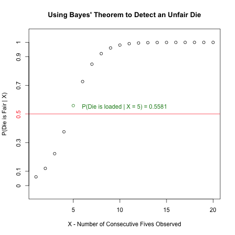
An occasionally dishonest casino uses 2 types of dice.  Of its dice, 97% are fair but 3% are unfair, and a “five” comes up 35% of the time for these unfair dice.  If you pick a die randomly and roll it, how many “fives”  in a row would you need to see before it was most likely that you had picked an unfair die?”

Read more to learn how to create the following plot and how it invokes Bayes’ Theorem to solve the above problem!

unfair die plot

Read more of this post

Exploratory Data Analysis: Combining Box Plots and Kernel Density Plots into Violin Plots for Ozone Pollution Data

Introduction

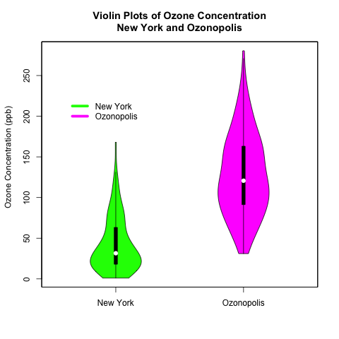
Recently, I began a series on exploratory data analysis (EDA), and I have written about descriptive statistics, box plots, and kernel density plots so far.  As previously mentioned in my post on box plots, there is a way to combine box plots and kernel density plots.  This combination results in violin plots, and I will show how to create them in R today.

Continuing from my previous posts on EDA, I will use 2 univariate data sets.  One is the “ozone” data vector that is part of the “airquality” data set that is built into R; this data set contains data on New York’s air pollution.  The other is a simulated data set of ozone pollution in a fictitious city called “Ozonopolis”.  It is important to remember that the ozone data from New York has missing values, and this has created complications that needed to be addressed in previous posts; missing values need to be addressed for violin plots, too, and in a different way than before.  

The vioplot() command in the “vioplot” package creates violin plots; the plotting options in this function are different and less versatile than other plotting functions that I have used in R.  Thus, I needed to be more creative with the plot(), title(), and axis() functions to create the plots that I want.  Read the details carefully to understand and benefit fully from the code.

violin plots

Read further to learn how to create these violin plots that combine box plots with kernel density plots!  Be careful – the syntax is more complicated than usual!

Read more of this post

Exploratory Data Analysis: Variations of Box Plots in R for Ozone Concentrations in New York City and Ozonopolis

Introduction

Last week, I wrote the first post in a series on exploratory data analysis (EDA).  I began by calculating summary statistics on a univariate data set of ozone concentration in New York City in the built-in data set “airquality” in R.  In particular, I talked about how to calculate those statistics when the data set has missing values.  Today, I continue this series by creating box plots in R and showing different variations and extensions that can be added; be sure to examine the details of this post’s R code for some valuable details.  I learned many of these tricks from Robert Kabacoff’s “R in Action” (2011).  Robert also has a nice blog called Quick-R that I consult often.

Recall that I the “Ozone” vector in the data set “airquality” has missing values.  Let’s remove those missing values first before constructing the box plots.

# abstract the raw data vector
ozone0 = airquality$Ozone

# remove the missing values
ozone = ozone0[!is.na(ozone)] 

Box Plots – What They Represent

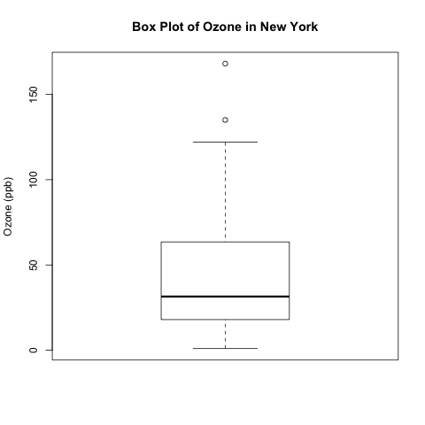
The simplest box plot can be obtained by using the basic settings in the boxplot() command.  As usual, I use png() and dev.off() to print the image to a local folder on my computer.

png('INSERT YOUR DIRECTORY HERE/box plot ozone.png')
boxplot(ozone, ylab = 'Ozone (ppb)', main = 'Box Plot of Ozone in New York')
dev.off()

box plot ozone

What do the different parts of this box plot mean?

Read more of this post