When Does the Kinetic Theory of Gases Fail? Examining its Postulates with Assistance from Simple Linear Regression in R

Introduction

The Ideal Gas Law, \text{PV} = \text{nRT} , is a very simple yet useful relationship that describes the behaviours of many gases pretty well in many situations.  It is “Ideal” because it makes some assumptions about gas particles that make the math and the physics easy to work with; in fact, the simplicity that arises from these assumptions allows the Ideal Gas Law to be easily derived from the kinetic theory of gases.  However, there are situations in which those assumptions are not valid, and, hence, the Ideal Gas Law fails.

Boyle’s law is inherently a part of the Ideal Gas Law.  It states that, at a given temperature, the pressure of an ideal gas is inversely proportional to its volume.  Equivalently, it states the product of the pressure and the volume of an ideal gas is a constant at a given temperature.

\text{P} \propto \text{V}^{-1}

An Example of The Failure of the Ideal Gas Law

This law is valid for many gases in many situations, but consider the following data on the pressure and volume of 1.000 g of oxygen at 0 degrees Celsius.  I found this data set in Chapter 5.2 of “General Chemistry” by Darrell Ebbing and Steven Gammon.

               Pressure (atm)      Volume (L)              Pressure X Volume (atm*L)
[1,]           0.25                2.8010                  0.700250
[2,]           0.50                1.4000                  0.700000
[3,]           0.75                0.9333                  0.699975
[4,]           1.00                0.6998                  0.699800
[5,]           2.00                0.3495                  0.699000
[6,]           3.00                0.2328                  0.698400
[7,]           4.00                0.1744                  0.697600
[8,]           5.00                0.1394                  0.697000

The right-most column is the product of pressure and temperature, and it is not constant.  However, are the differences between these values significant, or could it be due to some random variation (perhaps round-off error)?

Here is the scatter plot of the pressure-volume product with respect to pressure.
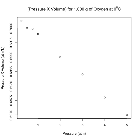
scatter plot pv vs pressure

These points don’t look like they are on a horizontal line!  Let’s analyze these data using normal linear least-squares regression in R.

Read more of this post

Estimating the Decay Rate and the Half-Life of DDT in Trout – Applying Simple Linear Regression with Logarithmic Transformation

This blog post uses a function and a script written in R that were displayed in an earlier blog post.

Introduction

This is the second of a series of blog posts about simple linear regression; the first was written recently on some conceptual nuances and subtleties about this model.  In this blog post, I will use simple linear regression to analyze a data set with a logarithmic transformation and discuss how to make inferences on the regression coefficients and the means of the target on the original scale.  The data document the decay of dichlorodiphenyltrichloroethane (DDT) in trout in Lake Michigan; I found it on Page 49 in the book “Elements of Environmental Chemistry” by Ronald A. Hites.  Future posts will also be written on the chemical aspects of this topic, including the environmental chemistry of DDT and exponential decay in chemistry and, in particular, radiochemistry.

DDT

Dichlorodiphenyltrichloroethane (DDT)

Source: Wikimedia Commons


A serious student of statistics or a statistician re-learning the fundamentals like myself should always try to understand the math and the statistics behind a software’s built-in function rather than treating it like a black box.  This is especially worthwhile for a basic yet powerful tool like simple linear regression.  Thus, instead of simply using the lm() function in R, I will reproduce the calculations done by lm() with my own function and script (posted earlier on my blog) to obtain inferential statistics on the regression coefficients.  However, I will not write or explain the math behind the calculations; they are shown in my own function with very self-evident variable names, in case you are interested.  The calculations are arguably the most straightforward aspects of linear regression, and you can easily find the derivations and formulas on the web, in introductory or applied statistics textbooks, and in regression textbooks.

Read more of this post

Adding Labels to Points in a Scatter Plot in R

What’s the Scatter?

A scatter plot displays the values of 2 variables for a set of data, and it is a very useful way to visualize data during exploratory data analysis, especially (though not exclusively) when you are interested in the relationship between a predictor variable and a target variable.  Sometimes, such data come with categorical labels that have important meanings, and the visualization of the relationship can be enhanced when these labels are attached to the data.

It is common practice to use a legend to label data that belong to a group, as I illustrated in a previous post on bar charts and pie charts.  However, what if every datum has a unique label, and there are many data in the scatter plot?  A legend would add unnecessary clutter in such situations.  Instead, it would be useful to write the label of each datum near its point in the scatter plot. I will show how to do this in R, illustrating the code with a built-in data set called LifeCycleSavings.

Read more of this post