How to Extract a String Between 2 Characters in R and SAS

Introduction

I recently needed to work with date values that look like this:

mydate
Jan 23/2
Aug 5/20
Dec 17/2

I wanted to extract the day, and the obvious strategy is to extract the text between the space and the slash.  I needed to think about how to program this carefully in both R and SAS, because

  1. the length of the day could be 1 or 2 characters long
  2. I needed a code that adapted to this varying length from observation to observation
  3. there is no function in either language that is suited exactly for this purpose.

In this tutorial, I will show you how to do this in both R and SAS.  I will write a function in R and a macro program in SAS to do so, and you can use the function and the macro program as you please!

Read more of this post

Useful Functions in R for Manipulating Text Data

Introduction

In my current job, I study HIV at the genetic and biochemical levels.  Thus, I often work with data involving the sequences of nucleotides or amino acids of various patient samples of HIV, and this type of work involves a lot of manipulating text.  (Strictly speaking, I analyze sequences of nucleotides from DNA that are reverse-transcribed from the HIV’s RNA.)  In this post, I describe some common functions in R that I often use for text processing.

Obtaining Basic Information about Character Variables

In R, I often work with text data in the form of character variables.  To check if a variable is a character variable, use the is.character() function.

> year = 2014
> is.character(year)
[1] FALSE

If a variable is not a character variable, you can convert it to a character variable using the as.character() function.

> year.char = as.character(year)
> is.character(year.char)
[1] TRUE

A basic piece of information about a character variable is the number of characters that exist in this string.  Use the nchar() function to obtain this information.

> nchar(year.char)
[1] 4

Read more of this post

Detecting Unfair Dice in Casinos with Bayes’ Theorem

Introduction

I saw an interesting problem that requires Bayes’ Theorem and some simple R programming while reading a bioinformatics textbook.  I will discuss the math behind solving this problem in detail, and I will illustrate some very useful plotting functions to generate a plot from R that visualizes the solution effectively.

The Problem

The following question is a slightly modified version of Exercise #1.2 on Page 8 in “Biological Sequence Analysis” by Durbin, Eddy, Krogh and Mitchison.

An occasionally dishonest casino uses 2 types of dice.  Of its dice, 97% are fair but 3% are unfair, and a “five” comes up 35% of the time for these unfair dice.  If you pick a die randomly and roll it, how many “fives”  in a row would you need to see before it was most likely that you had picked an unfair die?”

Read more to learn how to create the following plot and how it invokes Bayes’ Theorem to solve the above problem!

unfair die plot

Read more of this post

When Does the Kinetic Theory of Gases Fail? Examining its Postulates with Assistance from Simple Linear Regression in R

Introduction

The Ideal Gas Law, \text{PV} = \text{nRT} , is a very simple yet useful relationship that describes the behaviours of many gases pretty well in many situations.  It is “Ideal” because it makes some assumptions about gas particles that make the math and the physics easy to work with; in fact, the simplicity that arises from these assumptions allows the Ideal Gas Law to be easily derived from the kinetic theory of gases.  However, there are situations in which those assumptions are not valid, and, hence, the Ideal Gas Law fails.

Boyle’s law is inherently a part of the Ideal Gas Law.  It states that, at a given temperature, the pressure of an ideal gas is inversely proportional to its volume.  Equivalently, it states the product of the pressure and the volume of an ideal gas is a constant at a given temperature.

\text{P} \propto \text{V}^{-1}

An Example of The Failure of the Ideal Gas Law

This law is valid for many gases in many situations, but consider the following data on the pressure and volume of 1.000 g of oxygen at 0 degrees Celsius.  I found this data set in Chapter 5.2 of “General Chemistry” by Darrell Ebbing and Steven Gammon.

               Pressure (atm)      Volume (L)              Pressure X Volume (atm*L)
[1,]           0.25                2.8010                  0.700250
[2,]           0.50                1.4000                  0.700000
[3,]           0.75                0.9333                  0.699975
[4,]           1.00                0.6998                  0.699800
[5,]           2.00                0.3495                  0.699000
[6,]           3.00                0.2328                  0.698400
[7,]           4.00                0.1744                  0.697600
[8,]           5.00                0.1394                  0.697000

The right-most column is the product of pressure and temperature, and it is not constant.  However, are the differences between these values significant, or could it be due to some random variation (perhaps round-off error)?

Here is the scatter plot of the pressure-volume product with respect to pressure.

scatter plot pv vs pressure

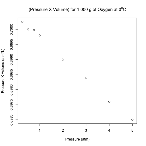
These points don’t look like they are on a horizontal line!  Let’s analyze these data using normal linear least-squares regression in R.

Read more of this post

Adding Labels to Points in a Scatter Plot in R

What’s the Scatter?

A scatter plot displays the values of 2 variables for a set of data, and it is a very useful way to visualize data during exploratory data analysis, especially (though not exclusively) when you are interested in the relationship between a predictor variable and a target variable.  Sometimes, such data come with categorical labels that have important meanings, and the visualization of the relationship can be enhanced when these labels are attached to the data.

It is common practice to use a legend to label data that belong to a group, as I illustrated in a previous post on bar charts and pie charts.  However, what if every datum has a unique label, and there are many data in the scatter plot?  A legend would add unnecessary clutter in such situations.  Instead, it would be useful to write the label of each datum near its point in the scatter plot. I will show how to do this in R, illustrating the code with a built-in data set called LifeCycleSavings.

Read more of this post