Exploratory Data Analysis – All Blog Posts on The Chemical Statistician

This series of posts introduced various methods of exploratory data analysis, providing theoretical backgrounds and practical examples.  Fully commented and readily usable R scripts are available for all topics for you to copy and paste for your own analysis!  Most of these posts involve data visualization and plotting, and I include a lot of detail and comments on how to invoke specific plotting commands in R in these examples.

I will return to this blog post to add new links as I write more tutorials.

Useful R Functions for Exploring a Data Frame

The 5-Number Summary – Two Different Methods in R

Combining Histograms and Density Plots to Examine the Distribution of the Ozone Pollution Data from New York in R

Conceptual Foundations of Histograms – Illustrated with New York’s Ozone Pollution Data

Quantile-Quantile Plots for New York’s Ozone Pollution Data

Kernel Density Estimation and Rug Plots in R on Ozone Data in New York and Ozonopolis

2 Ways of Plotting Empirical Cumulative Distribution Functions in R

Conceptual Foundations of Empirical Cumulative Distribution Functions

Combining Box Plots and Kernel Density Plots into Violin Plots for Ozone Pollution Data

Kernel Density Estimation – Conceptual Foundations

Variations of Box Plots in R for Ozone Concentrations in New York City and Ozonopolis

Computing Descriptive Statistics in R for Data on Ozone Pollution in New York City

How to Get the Frequency Table of a Categorical Variable as a Data Frame in R

The advantages of using count() to get N-way frequency tables as data frames in R
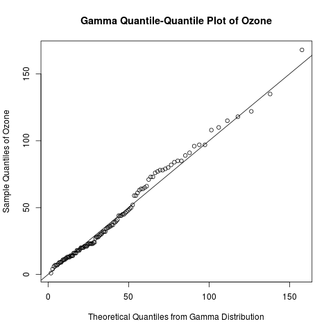
Exploratory Data Analysis: Quantile-Quantile Plots for New York’s Ozone Pollution Data

Introduction

Continuing my recent series on exploratory data analysis, today’s post focuses on quantile-quantile (Q-Q) plots, which are very useful plots for assessing how closely a data set fits a particular distribution.  I will discuss how Q-Q plots are constructed and use Q-Q plots to assess the distribution of the “Ozone” data from the built-in “airquality” data set in R.

Previous posts in this series on EDA include

gamma qq-plot ozone

Learn how to create a quantile-quantile plot like this one with R code in the rest of this blog!

Read more of this post

Exploratory Data Analysis: The 5-Number Summary – Two Different Methods in R

Introduction

Continuing my recent series on exploratory data analysis (EDA), today’s post focuses on 5-number summaries, which were previously mentioned in the post on descriptive statistics in this series.  I will define and calculate the 5-number summary in 2 different ways that are commonly used in R.  (It turns out that different methods arise from the lack of universal agreement among statisticians on how to calculate quantiles.)  I will show that the fivenum() function uses a simpler and more interpretable method to calculate the 5-number summary than the summary() function.  This post expands on a recent comment that I made to correct an error in the post on box plots.

> y = seq(1, 11, by = 2)
> y
[1]  1  3  5  7  9 11
> fivenum(y)
[1]  1  3  6  9 11
> summary(y)
     Min.   1st Qu.   Median    Mean     3rd Qu.    Max. 
     1.0     3.5       6.0       6.0      8.5       11.0

Why do these 2 methods of calculating the 5–number summary in R give different results?  Read the rest of this post to find out the answer!

Previous posts in this series on EDA include

Read more of this post

Exploratory Data Analysis: 2 Ways of Plotting Empirical Cumulative Distribution Functions in R

Introduction

Continuing my recent series on exploratory data analysis (EDA), and following up on the last post on the conceptual foundations of empirical cumulative distribution functions (CDFs), this post shows how to plot them in R.  (Previous posts in this series on EDA include descriptive statistics, box plots, kernel density estimation, and violin plots.)

I will plot empirical CDFs in 2 ways:

  1. using the built-in ecdf() and plot() functions in R
  2. calculating and plotting the cumulative probabilities against the ordered data

Continuing from the previous posts in this series on EDA, I will use the “Ozone” data from the built-in “airquality” data set in R.  Recall that this data set has missing values, and, just as before, this problem needs to be addressed when constructing plots of the empirical CDFs.

Recall the plot of the empirical CDF of random standard normal numbers in my earlier post on the conceptual foundations of empirical CDFs.  That plot will be compared to the plots of the empirical CDFs of the ozone data to check if they came from a normal distribution.

Read more of this post

Checking for Normality with Quantile Ranges and the Standard Deviation

Introduction

I was reading Michael Trosset’s “An Introduction to Statistical Inference and Its Applications with R”, and I learned a basic but interesting fact about the normal distribution’s interquartile range and standard deviation that I had not learned before.  This turns out to be a good way to check for normality in a data set.

In this post, I introduce several traditional ways of checking for normality (or goodness of fit in general), talk about the method that I learned from Trosset’s book, then build upon this method by possibly coming up with a new way to check for normality.  I have not fully established this idea, so I welcome your thoughts and ideas.

Read more of this post