Applied Statistics Lesson of the Day – The Coefficient of Variation

In my statistics classes, I learned to use the variance or the standard deviation to measure the variability or dispersion of a data set.  However, consider the following 2 hypothetical cases:

  1. the standard deviation for the incomes of households in Canada is $2,000
  2. the standard deviation for the incomes of the 5 major banks in Canada is $2,000

Even though this measure of dispersion has the same value for both sets of income data, $2,000 is a significant amount for a household, whereas $2,000 is not a lot of money for one of the “Big Five” banks.  Thus, the standard deviation alone does not give a fully accurate sense of the relative variability between the 2 data sets.  One way to overcome this limitation is to take the mean of the data sets into account.

A useful statistic for measuring the variability of a data set while scaling by the mean is the sample coefficient of variation:

\text{Sample Coefficient of Variation (} \bar{c_v} \text{)} \ = \ s \ \div \ \bar{x},

where s is the sample standard deviation and \bar{x} is the sample mean.

Analogously, the coefficient of variation for a random variable is

\text{Coefficient of Variation} \ (c_v) \ = \ \sigma \div \ \mu,

where \sigma is the random variable’s standard deviation and \mu is the random variable’s expected value.

The coefficient of variation is a very useful statistic that I, unfortunately, never learned in my introductory statistics classes.  I hope that all new statistics students get to learn this alternative measure of dispersion.
Exploratory Data Analysis: Quantile-Quantile Plots for New York’s Ozone Pollution Data

Introduction

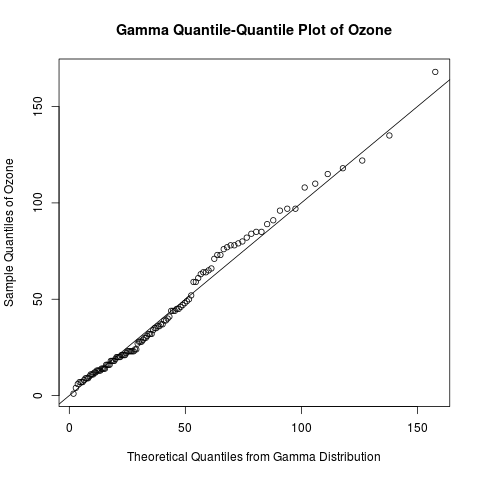
Continuing my recent series on exploratory data analysis, today’s post focuses on quantile-quantile (Q-Q) plots, which are very useful plots for assessing how closely a data set fits a particular distribution.  I will discuss how Q-Q plots are constructed and use Q-Q plots to assess the distribution of the “Ozone” data from the built-in “airquality” data set in R.

Previous posts in this series on EDA include

gamma qq-plot ozone

Learn how to create a quantile-quantile plot like this one with R code in the rest of this blog!

Read more of this post

Exploratory Data Analysis: Useful R Functions for Exploring a Data Frame

Introduction

Data in R are often stored in data frames, because they can store multiple types of data.  (In R, data frames are more general than matrices, because matrices can only store one type of data.)  Today’s post highlights some common functions in R that I like to use to explore a data frame before I conduct any statistical analysis.  I will use the built-in data set “InsectSprays” to illustrate these functions, because it contains categorical (character) and continuous (numeric) data, and that allows me to show different ways of exploring these 2 types of data.

If you have a favourite command for exploring data frames that is not in this post, please share it in the comments!

This post continues a recent series on exploratory data analysis.  Previous posts in this series include

Useful Functions for Exploring Data Frames

Use dim() to obtain the dimensions of the data frame (number of rows and number of columns).  The output is a vector.

> dim(InsectSprays)
[1] 72 2

Use nrow() and ncol() to get the number of rows and number of columns, respectively.  You can get the same information by extracting the first and second element of the output vector from dim(). 

> nrow(InsectSprays) 
# same as dim(InsectSprays)[1]
[1] 72
> ncol(InsectSprays)
# same as dim(InsectSprays)[2]
[1] 2

Read more of this post

Exploratory Data Analysis: The 5-Number Summary – Two Different Methods in R

Introduction

Continuing my recent series on exploratory data analysis (EDA), today’s post focuses on 5-number summaries, which were previously mentioned in the post on descriptive statistics in this series.  I will define and calculate the 5-number summary in 2 different ways that are commonly used in R.  (It turns out that different methods arise from the lack of universal agreement among statisticians on how to calculate quantiles.)  I will show that the fivenum() function uses a simpler and more interpretable method to calculate the 5-number summary than the summary() function.  This post expands on a recent comment that I made to correct an error in the post on box plots.

> y = seq(1, 11, by = 2)
> y
[1]  1  3  5  7  9 11
> fivenum(y)
[1]  1  3  6  9 11
> summary(y)
     Min.   1st Qu.   Median    Mean     3rd Qu.    Max. 
     1.0     3.5       6.0       6.0      8.5       11.0

Why do these 2 methods of calculating the 5–number summary in R give different results?  Read the rest of this post to find out the answer!

Previous posts in this series on EDA include

Read more of this post

Exploratory Data Analysis: Variations of Box Plots in R for Ozone Concentrations in New York City and Ozonopolis

Introduction

Last week, I wrote the first post in a series on exploratory data analysis (EDA).  I began by calculating summary statistics on a univariate data set of ozone concentration in New York City in the built-in data set “airquality” in R.  In particular, I talked about how to calculate those statistics when the data set has missing values.  Today, I continue this series by creating box plots in R and showing different variations and extensions that can be added; be sure to examine the details of this post’s R code for some valuable details.  I learned many of these tricks from Robert Kabacoff’s “R in Action” (2011).  Robert also has a nice blog called Quick-R that I consult often.

Recall that I the “Ozone” vector in the data set “airquality” has missing values.  Let’s remove those missing values first before constructing the box plots.

# abstract the raw data vector
ozone0 = airquality$Ozone

# remove the missing values
ozone = ozone0[!is.na(ozone)] 

Box Plots – What They Represent

The simplest box plot can be obtained by using the basic settings in the boxplot() command.  As usual, I use png() and dev.off() to print the image to a local folder on my computer.

png('INSERT YOUR DIRECTORY HERE/box plot ozone.png')
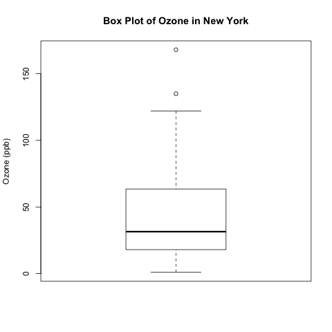
boxplot(ozone, ylab = 'Ozone (ppb)', main = 'Box Plot of Ozone in New York')
dev.off()

box plot ozone

What do the different parts of this box plot mean?

Read more of this post

Exploratory Data Analysis – Computing Descriptive Statistics in R for Data on Ozone Pollution in New York City

Introduction

This is the first of a series of posts on exploratory data analysis (EDA).  This post will calculate the common summary statistics of a univariate continuous data set – the data on ozone pollution in New York City that is part of the built-in “airquality” data set in R.  This is a particularly good data set to work with, since it has missing values – a common problem in many real data sets.  In later posts, I will continue this series by exploring other methods in EDA, including box plots and kernel density plots.

Read more of this post

How to Calculate a Partial Correlation Coefficient in R: An Example with Oxidizing Ammonia to Make Nitric Acid

Introduction

Today, I will talk about the math behind calculating partial correlation and illustrate the computation in R.  The computation uses an example involving the oxidation of ammonia to make nitric acid, and this example comes from a built-in data set in R called stackloss.

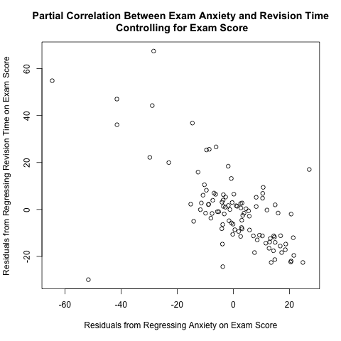
I read Pages 234-237 in Section 6.6 of “Discovering Statistics Using R” by Andy Field, Jeremy Miles, and Zoe Field to learn about partial correlation.  They used a data set called “Exam Anxiety.dat” available from their companion web site (look under “6 Correlation”) to illustrate this concept; they calculated the partial correlation coefficient between exam anxiety and revision time while controlling for exam score.  As I discuss further below, the plot between the 2 above residuals helps to illustrate the calculation of partial correlation coefficients.  This plot makes intuitive sense; if you take more time to study for an exam, you tend to have less exam anxiety, so there is a negative correlation between revision time and exam anxiety.

residuals plot anxiety and revision time controlling exam score

They used a function called pcor() in a package called “ggm”; however, I suspect that this package is no longer working properly, because it depends on a deprecated package called “RBGL” (i.e. “RBGL” is no longer available in CRAN).  See this discussion thread for further information.  Thus, I wrote my own R function to illustrate partial correlation.

Partial correlation is the correlation between 2 random variables while holding other variables constant.  To calculate the partial correlation between X and Y while holding Z constant (or controlling for the effect of Z, or averaging out Z),

Read more of this post

Checking for Normality with Quantile Ranges and the Standard Deviation

Introduction

I was reading Michael Trosset’s “An Introduction to Statistical Inference and Its Applications with R”, and I learned a basic but interesting fact about the normal distribution’s interquartile range and standard deviation that I had not learned before.  This turns out to be a good way to check for normality in a data set.

In this post, I introduce several traditional ways of checking for normality (or goodness of fit in general), talk about the method that I learned from Trosset’s book, then build upon this method by possibly coming up with a new way to check for normality.  I have not fully established this idea, so I welcome your thoughts and ideas.

Read more of this post

Displaying Isotopic Abundance Percentages with Bar Charts and Pie Charts

The Structure of an Atom

An atom consists of a nucleus at the centre and electrons moving around it.  The nucleus contains a mixture of protons and neutrons.  For most purposes in chemistry, the two most important properties about these 3 types of particles are their masses and charges.  In terms of charge, protons are positive, electrons are negative, and neutrons are neutral.  A proton’s mass is roughly the same as a neutron’s mass, but a proton is almost 2,000 times heavier than an electron.

lithium atom

This image shows a lithium atom, which has 3 electrons, 3 protons, and 4 neutrons.  

Source: Wikimedia Commons

Read more of this post