A SAS macro to automatically label variables using another data set

Introduction

When I write SAS programs, I usually export the analytical results into an output that a client will read.  I often cannot show the original variable names in these outputs; there are 2 reasons for this:

  • The maximal length of a SAS variable’s name is 32 characters, whereas the description of the variable can be much longer.  This is the case for my current job in marketing analytics.
  • Only letters, numbers, and underscores are allowed in a SAS variable’s name.  Spaces and special characters are not allowed.  Thus, if a variable’s name is quite long and complicated to describe, then the original variable name would be not suitable for presentation or awkward to read.  It may be so abbreviated that it is devoid of practical meaning.

This is why labelling variables can be a good idea.  However, I usually label variables manually in a DATA step or within PROC SQL, which can be very slow and prone to errors.  I recently worked on a data set with 193 variables, most of which require long descriptions to understand what they mean.  Labelling them individually and manually was not a realistic method, so I sought an automated or programmatic way to do so.

Read more of this post

Mathematical Statistics Lesson of the Day – Ancillary Statistics

The set-up for today’s post mirrors my earlier Statistics Lessons of the Day on sufficient statistics and complete statistics.

Suppose that you collected data

\mathbf{X} = X_1, X_2, ..., X_n

in order to estimate a parameter \theta.  Let f_\theta(x) be the probability density function (PDF) or probability mass function (PMF) for X_1, X_2, ..., X_n.

Let

a = A(\mathbf{X})

be a statistics based on \textbf{X}.

If the distribution of A(\textbf{X}) does NOT depend on \theta, then A(\textbf{X}) is called an ancillary statistic.

An ancillary statistic contains no information about \theta; its distribution is fixed and known without any relation to \theta.  Why, then, would we care about A(\textbf{X})  I will address this question in later Statistics Lessons of the Day, and I will connect ancillary statistics to sufficient statistics, minimally sufficient statistics and complete statistics.

Eric’s Enlightenment for Wednesday, April 29, 2015

  1. Anscombe’s quartet is a collection of 4 data sets that have almost identical summary statistics but appear very differently when plotted.  They illustrate the importance of visualizing your data first before plugging them into a statistical model.
  2. A potential geochemical explanation for the existence of Blood Falls, an outflow of saltwater tainted with iron (III) oxide at the snout of the Taylor Glacier in Antarctica.  Here is the original Nature paper by Jill Mikucki et al.
  3. Jonathan Rothwell and Siddharth Kulkarni from the Brookings Institution use a value-added approach to rank 2-year and 4-year post-secondary institutions in the USA.  Some of the top-ranked universities by this measure are lesser known schools like Colgate University, Rose-Hulman Institute of Technology, and Carleton College.  I would love to see something similar for Canada!
  4. Heather Krause from Datassist provides tips on how to avoid (accidentally) lying with your data.  Do read the linked sources of further information!

Applied Statistics Lesson of the Day – The Coefficient of Variation

In my statistics classes, I learned to use the variance or the standard deviation to measure the variability or dispersion of a data set.  However, consider the following 2 hypothetical cases:

  1. the standard deviation for the incomes of households in Canada is $2,000
  2. the standard deviation for the incomes of the 5 major banks in Canada is $2,000

Even though this measure of dispersion has the same value for both sets of income data, $2,000 is a significant amount for a household, whereas $2,000 is not a lot of money for one of the “Big Five” banks.  Thus, the standard deviation alone does not give a fully accurate sense of the relative variability between the 2 data sets.  One way to overcome this limitation is to take the mean of the data sets into account.

A useful statistic for measuring the variability of a data set while scaling by the mean is the sample coefficient of variation:

\text{Sample Coefficient of Variation (} \bar{c_v} \text{)} \ = \ s \ \div \ \bar{x},

where s is the sample standard deviation and \bar{x} is the sample mean.

Analogously, the coefficient of variation for a random variable is

\text{Coefficient of Variation} \ (c_v) \ = \ \sigma \div \ \mu,

where \sigma is the random variable’s standard deviation and \mu is the random variable’s expected value.

The coefficient of variation is a very useful statistic that I, unfortunately, never learned in my introductory statistics classes.  I hope that all new statistics students get to learn this alternative measure of dispersion.

Exploratory Data Analysis: Quantile-Quantile Plots for New York’s Ozone Pollution Data

Introduction

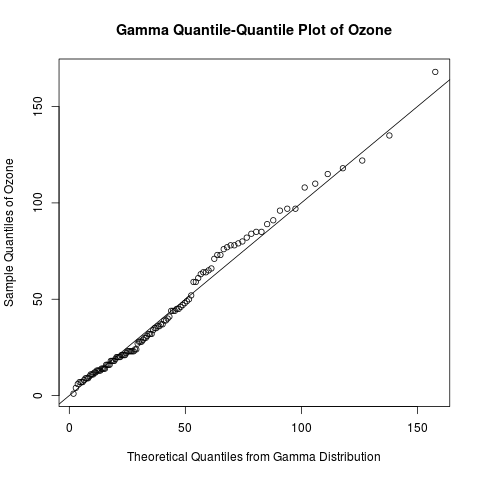
Continuing my recent series on exploratory data analysis, today’s post focuses on quantile-quantile (Q-Q) plots, which are very useful plots for assessing how closely a data set fits a particular distribution.  I will discuss how Q-Q plots are constructed and use Q-Q plots to assess the distribution of the “Ozone” data from the built-in “airquality” data set in R.

Previous posts in this series on EDA include

gamma qq-plot ozone

Learn how to create a quantile-quantile plot like this one with R code in the rest of this blog!

Read more of this post

Exploratory Data Analysis: Useful R Functions for Exploring a Data Frame

Introduction

Data in R are often stored in data frames, because they can store multiple types of data.  (In R, data frames are more general than matrices, because matrices can only store one type of data.)  Today’s post highlights some common functions in R that I like to use to explore a data frame before I conduct any statistical analysis.  I will use the built-in data set “InsectSprays” to illustrate these functions, because it contains categorical (character) and continuous (numeric) data, and that allows me to show different ways of exploring these 2 types of data.

If you have a favourite command for exploring data frames that is not in this post, please share it in the comments!

This post continues a recent series on exploratory data analysis.  Previous posts in this series include

Useful Functions for Exploring Data Frames

Use dim() to obtain the dimensions of the data frame (number of rows and number of columns).  The output is a vector.

> dim(InsectSprays)
[1] 72 2

Use nrow() and ncol() to get the number of rows and number of columns, respectively.  You can get the same information by extracting the first and second element of the output vector from dim(). 

> nrow(InsectSprays) 
# same as dim(InsectSprays)[1]
[1] 72
> ncol(InsectSprays)
# same as dim(InsectSprays)[2]
[1] 2

Read more of this post

Exploratory Data Analysis: The 5-Number Summary – Two Different Methods in R

Introduction

Continuing my recent series on exploratory data analysis (EDA), today’s post focuses on 5-number summaries, which were previously mentioned in the post on descriptive statistics in this series.  I will define and calculate the 5-number summary in 2 different ways that are commonly used in R.  (It turns out that different methods arise from the lack of universal agreement among statisticians on how to calculate quantiles.)  I will show that the fivenum() function uses a simpler and more interpretable method to calculate the 5-number summary than the summary() function.  This post expands on a recent comment that I made to correct an error in the post on box plots.

> y = seq(1, 11, by = 2)
> y
[1]  1  3  5  7  9 11
> fivenum(y)
[1]  1  3  6  9 11
> summary(y)
     Min.   1st Qu.   Median    Mean     3rd Qu.    Max. 
     1.0     3.5       6.0       6.0      8.5       11.0

Why do these 2 methods of calculating the 5–number summary in R give different results?  Read the rest of this post to find out the answer!

Previous posts in this series on EDA include

Read more of this post

Exploratory Data Analysis: Combining Histograms and Density Plots to Examine the Distribution of the Ozone Pollution Data from New York in R

Introduction

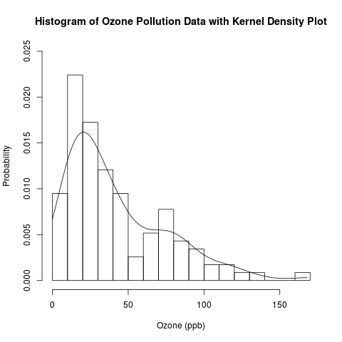
This is a follow-up post to my recent introduction of histograms.  Previously, I presented the conceptual foundations of histograms and used a histogram to approximate the distribution of the “Ozone” data from the built-in data set “airquality” in R.  Today, I will examine this distribution in more detail by overlaying the histogram with parametric and non-parametric kernel density plots.  I will finally answer the question that I have asked (and hinted to answer) several times: Are the “Ozone” data normally distributed, or is another distribution more suitable?

histogram and kernel density plot

Read the rest of this post to learn how to combine histograms with density curves like this above plot!

This is another post in my continuing series on exploratory data analysis (EDA).  Previous posts in this series on EDA include

Read more of this post

Exploratory Data Analysis: Conceptual Foundations of Histograms – Illustrated with New York’s Ozone Pollution Data

Introduction

Continuing my recent series on exploratory data analysis (EDA), today’s post focuses on histograms, which are very useful plots for visualizing the distribution of a data set.  I will discuss how histograms are constructed and use histograms to assess the distribution of the “Ozone” data from the built-in “airquality” data set in R.  In a later post, I will assess the distribution of the “Ozone” data in greater depth by combining histograms with various types of density plots.

Previous posts in this series on EDA include

histogram

Read the rest of this post to learn how to construct a histogram and get the R code for producing the above plot!

Read more of this post

Exploratory Data Analysis: 2 Ways of Plotting Empirical Cumulative Distribution Functions in R

Introduction

Continuing my recent series on exploratory data analysis (EDA), and following up on the last post on the conceptual foundations of empirical cumulative distribution functions (CDFs), this post shows how to plot them in R.  (Previous posts in this series on EDA include descriptive statistics, box plots, kernel density estimation, and violin plots.)

I will plot empirical CDFs in 2 ways:

  1. using the built-in ecdf() and plot() functions in R
  2. calculating and plotting the cumulative probabilities against the ordered data

Continuing from the previous posts in this series on EDA, I will use the “Ozone” data from the built-in “airquality” data set in R.  Recall that this data set has missing values, and, just as before, this problem needs to be addressed when constructing plots of the empirical CDFs.

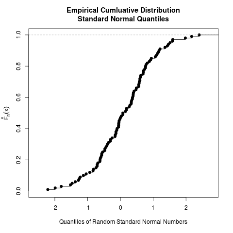
Recall the plot of the empirical CDF of random standard normal numbers in my earlier post on the conceptual foundations of empirical CDFs.  That plot will be compared to the plots of the empirical CDFs of the ozone data to check if they came from a normal distribution.

Read more of this post

Exploratory Data Analysis: Conceptual Foundations of Empirical Cumulative Distribution Functions

Introduction

Continuing my recent series on exploratory data analysis (EDA), this post focuses on the conceptual foundations of empirical cumulative distribution functions (CDFs); in a separate post, I will show how to plot them in R.  (Previous posts in this series include descriptive statistics, box plots, kernel density estimation, and violin plots.)

To give you a sense of what an empirical CDF looks like, here is an example created from 100 randomly generated numbers from the standard normal distribution.  The ecdf() function in R was used to generate this plot; the entire code is provided at the end of this post, but read my next post for more detail on how to generate plots of empirical CDFs in R.

ecdf standard normal

Read to rest of this post to learn what an empirical CDF is and how to produce the above plot!

Read more of this post

Exploratory Data Analysis: Combining Box Plots and Kernel Density Plots into Violin Plots for Ozone Pollution Data

Introduction

Recently, I began a series on exploratory data analysis (EDA), and I have written about descriptive statistics, box plots, and kernel density plots so far.  As previously mentioned in my post on box plots, there is a way to combine box plots and kernel density plots.  This combination results in violin plots, and I will show how to create them in R today.

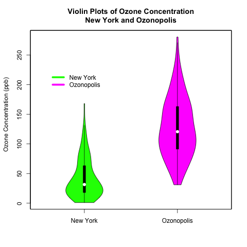
Continuing from my previous posts on EDA, I will use 2 univariate data sets.  One is the “ozone” data vector that is part of the “airquality” data set that is built into R; this data set contains data on New York’s air pollution.  The other is a simulated data set of ozone pollution in a fictitious city called “Ozonopolis”.  It is important to remember that the ozone data from New York has missing values, and this has created complications that needed to be addressed in previous posts; missing values need to be addressed for violin plots, too, and in a different way than before.  

The vioplot() command in the “vioplot” package creates violin plots; the plotting options in this function are different and less versatile than other plotting functions that I have used in R.  Thus, I needed to be more creative with the plot(), title(), and axis() functions to create the plots that I want.  Read the details carefully to understand and benefit fully from the code.

violin plots

Read further to learn how to create these violin plots that combine box plots with kernel density plots!  Be careful – the syntax is more complicated than usual!

Read more of this post

Don’t Take Good Data for Granted: A Caution for Statisticians

Background

Yesterday, I had the pleasure of attending my first Spring Alumni Reunion at the University of Toronto.  (I graduated from its Master of Science program in statistics in 2012.)  There were various events for the alumni: attend interesting lectures, find out about our school’s newest initiatives, and meet other alumni in smaller gatherings tailored for particular groups or interests.  The event was very well organized and executed, and I am very appreciative of my alma mater for working so hard to include us in our university’s community beyond graduation.  Most of the attendees graduated 20 or more years ago; I met quite a few who graduated in the 1950’s and 1960’s.  It was quite interesting to chat with them over lunch and during breaks to learn about what our school was like back then.  (Incidentally, I did not meet anyone who graduated in the last 2 years.)

A Thought-Provoking Lecture

My highlight at the reunion event was attending Joseph Wong‘s lecture on poverty, governmental welfare programs, developmental economics in poor countries, and social innovation.  (He is a political scientist at UToronto, and you can find videos of him discussing his ideas on Youtube.)  Here are a few of his key ideas that I took away; note that these are my interpretations of what I can remember from the lecture, so they are not transcriptions or even paraphrases of his exact words:

  1. Many workers around the world are not documented by official governmental records.  This is especially true in developing countries, where the nature of the employer-employee relationship (e.g. contractual work, temporary work, unreported labour) or the limitations of the survey/sampling methods make many of these “invisible workers” unrepresented.  Wong argues that this leads to inequitable distribution of welfare programs that aim to re-distribute wealth.
  2. Social innovation is harnessing knowledge to create an impact.  It often does NOT involve inventing a new technology, but actually combining, re-combining, or arranging existing knowledge and technologies to solve a social problem in an innovative way.  Wong addressed this in further detail in a recent U of T News article.
  3. Poor people will not automatically flock to take advantage of a useful product or service just because of a decrease in price.  Sometimes, substantial efforts and intelligence in marketing are needed to increase the quantity demanded.  A good example is the Tata Nano, a small car that was made and sold in India with huge expectations but underwhelming success.
  4. Poor people often need to mitigate a lot of risk, and that can have a significant and surprising effect on their behaviour in response to the availability of social innovations.  For example, a poor person may forgo a free medical treatment or diagnostic screening if he/she risks losing a job or a business opportunity by taking the time away from work to get that treatment/screening.  I asked him about the unrealistic assumptions that he often sees in economic models based on his field work, and he notes that absence of risk (e.g. in cost functions) as one such common unrealistic assumption.

The Importance of Checking the Quality of the Data

These are all very interesting points to me in their own right.  However, Point #1 is especially important to me as a statistician.  During my Master’s degree, I was warned that most data sets in practice are not immediately ready for analysis, and substantial data cleaning is needed before any analysis can be done; data cleaning can often take 80% of the total amount of time in a project.  I have seen examples of this in my job since finishing my graduate studies a little over a year ago, and I’m sure that I will see more of it in the future.

Even before cleaning the data, it is important to check how the data were collected.  If sampling or experimental methods were used, it is essential to check if they were used or designed properly.  It would be unsurprising to learn that many bureaucrats, policy makers, and elected officials have used unreliable labour statistics to guide all kinds of economic policies on business, investment, finance, welfare, and labour – let alone the other non-economic justifications and factors, like politics, that cloud and distort these policies even further.

We statisticians have a saying about data quality: “garbage in – garbage out”.  If the data are of poor quality, then any insights derived from analyzing those data are useless, regardless of how good the analysis or the modelling technique is.  As a statistician, I cannot take good data for granted, and I aim to be more vigilant about the quality and the source of the data before I begin to analyze them.
Exploratory Data Analysis – Computing Descriptive Statistics in R for Data on Ozone Pollution in New York City

Introduction

This is the first of a series of posts on exploratory data analysis (EDA).  This post will calculate the common summary statistics of a univariate continuous data set – the data on ozone pollution in New York City that is part of the built-in “airquality” data set in R.  This is a particularly good data set to work with, since it has missing values – a common problem in many real data sets.  In later posts, I will continue this series by exploring other methods in EDA, including box plots and kernel density plots.

Read more of this post

How do Dew and Fog Form? Nature at Work with Temperature, Vapour Pressure, and Partial Pressure

In the early morning, especially here in Canada, I often see dew – water droplets formed by the condensation of water vapour on outside surfaces, like windows, car roofs, and leaves of trees.  I also sometimes see fog – water droplets or ice crystals that are suspended in air and often blocking visibility at great distances.  Have you ever wondered how they form?  It turns out that partial pressure, vapour pressure and temperature are the key phenomena at work.

dew fog

Dew (by Staffan Enbom) and Fog (by Jon Zander)

Source: Wikimedia

Read more of this post

Checking for Normality with Quantile Ranges and the Standard Deviation

Introduction

I was reading Michael Trosset’s “An Introduction to Statistical Inference and Its Applications with R”, and I learned a basic but interesting fact about the normal distribution’s interquartile range and standard deviation that I had not learned before.  This turns out to be a good way to check for normality in a data set.

In this post, I introduce several traditional ways of checking for normality (or goodness of fit in general), talk about the method that I learned from Trosset’s book, then build upon this method by possibly coming up with a new way to check for normality.  I have not fully established this idea, so I welcome your thoughts and ideas.

Read more of this post

Estimating the Decay Rate and the Half-Life of DDT in Trout – Applying Simple Linear Regression with Logarithmic Transformation

This blog post uses a function and a script written in R that were displayed in an earlier blog post.

Introduction

This is the second of a series of blog posts about simple linear regression; the first was written recently on some conceptual nuances and subtleties about this model.  In this blog post, I will use simple linear regression to analyze a data set with a logarithmic transformation and discuss how to make inferences on the regression coefficients and the means of the target on the original scale.  The data document the decay of dichlorodiphenyltrichloroethane (DDT) in trout in Lake Michigan; I found it on Page 49 in the book “Elements of Environmental Chemistry” by Ronald A. Hites.  Future posts will also be written on the chemical aspects of this topic, including the environmental chemistry of DDT and exponential decay in chemistry and, in particular, radiochemistry.

DDT

Dichlorodiphenyltrichloroethane (DDT)

Source: Wikimedia Commons


A serious student of statistics or a statistician re-learning the fundamentals like myself should always try to understand the math and the statistics behind a software’s built-in function rather than treating it like a black box.  This is especially worthwhile for a basic yet powerful tool like simple linear regression.  Thus, instead of simply using the lm() function in R, I will reproduce the calculations done by lm() with my own function and script (posted earlier on my blog) to obtain inferential statistics on the regression coefficients.  However, I will not write or explain the math behind the calculations; they are shown in my own function with very self-evident variable names, in case you are interested.  The calculations are arguably the most straightforward aspects of linear regression, and you can easily find the derivations and formulas on the web, in introductory or applied statistics textbooks, and in regression textbooks.

Read more of this post

Discovering Argon with the 2-Sample t-Test

I learned about Lord Rayleigh’s discovery of argon in my 2nd-year analytical chemistry class while reading “Quantitative Chemical Analysis” by Daniel Harris.  (William Ramsay was also responsible for this discovery.)  This is one of my favourite stories in chemistry; it illustrates how diligence in measurement can lead to an elegant and surprising discovery.  I find no evidence that Rayleigh and Ramsay used statistics to confirm their findings; their paper was published 13 years before Gosset published about the t-test.  Thus, I will use a 2-sample t-test in R to confirm their result.

Lord Rayleigh                                    William Ramsay

Photos of Lord Rayleigh and William Ramsay

Source: Wikimedia Commons

Read more of this post

Adding Labels to Points in a Scatter Plot in R

What’s the Scatter?

A scatter plot displays the values of 2 variables for a set of data, and it is a very useful way to visualize data during exploratory data analysis, especially (though not exclusively) when you are interested in the relationship between a predictor variable and a target variable.  Sometimes, such data come with categorical labels that have important meanings, and the visualization of the relationship can be enhanced when these labels are attached to the data.

It is common practice to use a legend to label data that belong to a group, as I illustrated in a previous post on bar charts and pie charts.  However, what if every datum has a unique label, and there are many data in the scatter plot?  A legend would add unnecessary clutter in such situations.  Instead, it would be useful to write the label of each datum near its point in the scatter plot. I will show how to do this in R, illustrating the code with a built-in data set called LifeCycleSavings.

Read more of this post

Displaying Isotopic Abundance Percentages with Bar Charts and Pie Charts

The Structure of an Atom

An atom consists of a nucleus at the centre and electrons moving around it.  The nucleus contains a mixture of protons and neutrons.  For most purposes in chemistry, the two most important properties about these 3 types of particles are their masses and charges.  In terms of charge, protons are positive, electrons are negative, and neutrons are neutral.  A proton’s mass is roughly the same as a neutron’s mass, but a proton is almost 2,000 times heavier than an electron.

lithium atom

This image shows a lithium atom, which has 3 electrons, 3 protons, and 4 neutrons.  

Source: Wikimedia Commons

Read more of this post