New Job at the Bank of Montreal in Toronto

I have accepted an offer from the Bank of Montreal to become a Manager of Operational Risk Analytics and Modelling at its corporate headquarter office in Toronto.  Thus, I have resigned from my job at the British Columbia Cancer Agency.  I will leave Vancouver at the end of December, 2015, and start my new job at the beginning of January, 2016.

I have learned some valuable skills and met some great people here in Vancouver over the past 2 years.  My R programming skills have improved a lot, especially in text processing.  My SAS programming skills have improved a lot, and I began a new section on my blog to SAS programming as a result of what I learned.  I volunteered and delivered presentations for the Vancouver SAS User Group (VanSUG) – once on statistical genetics, and another on sampling strategies in analytical chemistry, ANOVA, and PROC TRANSPOSE.  I have thoroughly enjoyed meeting some smart and helpful people at the Data Science, Machine Learning, and R Programming Meetups.

I lived in Toronto from 2011 to 2013 while pursuing my Master’s degree in statistics at the  University of Toronto and working as a statistician at Predicum.  I look forward to re-connecting with my colleagues there.

Data Science Seminar by David Campbell on Approximate Bayesian Computation and the Earthworm Invasion in Canada

My colleague, David Campbell, will be the feature speaker at the next Vancouver Data Science Meetup on Thursday, June 25.  (This is a jointly organized event with the Vancouver Machine Learning Meetup and the Vancouver R Users Meetup.)  He will present his research on approximate Bayesian computation and Markov Chain Monte Carlo, and he will highlight how he has used these tools to study the invasion of European earthworms in Canada, especially their drastic effects on the boreal forests in Alberta.

Dave is a statistics professor at Simon Fraser University, and I have found him to be very smart and articulate in my communication with him.  This seminar promises to be both entertaining and educational.  If you will attend it, then I look forward to seeing you there!  Check out Dave on Twitter and LInkedIn.

Title: The great Canadian worm invasion (from an approximate Bayesian computation perspective)

Speaker: David Campbell

Date: Thursday, June 25

Place:

HootSuite (Headquarters)

5 East 8th Avenue

Vancouver, BC

Schedule:

• 6:00 pm: Doors are open – feel free to mingle!
• 6:30 pm: Presentation begins.
• ~7:45 Off to a nearby restaurant for food, drinks, and breakout discussions.

Abstract:

After being brought in by pioneers for agricultural reasons, European earthworms have been taking North America by storm and are starting to change the Alberta Boreal forests. This talk uses an invasive species model to introduce the basic ideas behind estimating the rate of new worm introductions and how quickly they spread with the goal of predicting the future extent of the great Canadian worm invasion. To take on the earthworm invaders, we turn to Approximate Bayesian Computation methods. Bayesian statistics are used to gather and update knowledge as new information becomes available owing to their success in prediction and estimating ongoing and evolving processes. Approximate Bayesian Computation is a step in the right direction when it’s just not possible to actually do the right thing- in this case using the exact invasive species model is infeasible. These tools will be used within a Markov Chain Monte Carlo framework.

About Dave Campbell:

Dave Campbell is an Associate Professor in the Department of Statistics and Actuarial Science at Simon Fraser University and Director of the Management and Systems Science Program. Dave’s main research area is at the intersections of statistics with computer science, applied math, and numerical analysis. Dave has published papers on Bayesian algorithms, adaptive time-frequency estimation, and dealing with lack of identifiability. His students have gone on to faculty positions and worked in industry at video game companies and predicting behaviour in malls, chat rooms, and online sales.
How to Extract a String Between 2 Characters in R and SAS

Introduction

I recently needed to work with date values that look like this:

mydate
Jan 23/2
Aug 5/20
Dec 17/2

I wanted to extract the day, and the obvious strategy is to extract the text between the space and the slash.  I needed to think about how to program this carefully in both R and SAS, because

  1. the length of the day could be 1 or 2 characters long
  2. I needed a code that adapted to this varying length from observation to observation
  3. there is no function in either language that is suited exactly for this purpose.

In this tutorial, I will show you how to do this in both R and SAS.  I will write a function in R and a macro program in SAS to do so, and you can use the function and the macro program as you please!

Read more of this post

Eric’s Enlightenment for Friday, June 5, 2015

  1. Christian Robert provides a gentle introduction to the Metropolis-Hastings algorithm with accompanying R codes.  (Hat Tip: David Campbell)
  2. John Sall demonstrates how to perform discriminant analysis in JMP, especially for data sets with many variables.
  3. Using machine learning instead of human judgment may improve the selection of job candidates.  This article also includes an excerpt from a New York Times article about how the Milwaukee Bucks used facial recognition as one justification to choose Jabari Parker over Dante Exum.  (Hat Tip: Tyler Cowen)
  4. “A hospital at the University of California San Francisco Medical Center has a robot filling prescriptions.”

Eric’s Enlightenment for Thursday, May 7, 2015

  1. “Across the United States, more than half a million kids are poisoned by lead each year…” – much of it due to lead being used in building houses.
  2. At a global business consulting company where 80-hour work weeks are normal, 31% of men and 11% of women examined in Erin Reid’s study “managed to achieve the benefits of a more moderate work schedule without explicitly asking for it“.  Surprisingly, they “received performance reviews that were as strong as their hyper-ambitious colleagues. For people who were good at faking it, there was no real damage done by their lighter workloads”.
  3. Tom Short’s very useful reference card of major and commonly used functions in R – only 4 pages!  In case that first link ever becomes severed, here is the PDF file.
  4. I offer my deepest condolences to Sheryl Sandberg for the recent death of her husband, Dave Goldberg.  I normally post only technical information on this blog, but Katie Hafner’s letter to Sheryl deserves much sharing, and it may help others who endure a similar tragedy.  It is very well written and full of practical and philosophical advice from her own experience in suddenly losing her first husband at an early age.

Eric’s Enlightenment for Tuesday, April 28, 2015

  1. On a yearly basis, the production of almonds in California uses more water than businesses and residences in San Francisco and Los Angeles combined.  Alex Tabarrok explains why.
  2. How patient well-being and patient satisfaction become conflicting objectives in hospitals – a case study of a well-intended policy with deadly consequences.  (HT: Frances Woolley – with a thought about academia.)
  3. Contrary to a long-held presumption about the stability of DNA in mature cells, Huimei Yu et al. show that neurons use DNA methylation to rewrite their DNA throughout each day.  This is done to adjust the brain to different activity levels as its function changes over time.
  4. Alex Yakubovitch provides a tutorial on regular expressions (patterns that define sets of strings) and how to use them in R.

Eric’s Enlightenment for Wednesday, April 22, 2015

  1. Frances Woolley’s useful reading list on tax policy for Canadians with disabilities
  2. Jeff Rosenthal asked a seemingly simple yet subtle question about uncorrelated normal random variables.
  3. A great catalogue of colours with their names in R – very useful for data visualization!
  4. Paul Crutzen’s proposed scheme to inject sulfur dioxide into the stratosphere – this would create sulfate aerosols for deflecting sunlight to counteract global warming, but he carefully weighed the serious pros and cons of this risky scheme.

Resources for Learning Data Manipulation in R, SAS and Microsoft Excel

I had the great pleasure of speaking to the Department of Statistics and Actuarial Science at Simon Fraser University on last Friday to share my career advice with its students and professors.  I emphasized the importance of learning skills in data manipulation during my presentation, and I want to supplement my presentation by posting some useful resources for this skill.  If you are new to data manipulation, these are good guides for how to get started in R, SAS and Microsoft Excel.

For R, I recommend Winston Chang’s excellent web site, “Cookbook for R“.  It has a specific section on manipulating data; this is a comprehensive list of the basic skills that every data analyst and statistician should learn.

For SAS, I recommend the UCLA statistical computing web page that is adapted from Oliver Schabenberger’s web site.

For Excel, I recommend Excel Easy, a web site that was started at the University of Amsterdam in 2010.  It is a good resource for learning about Excel in general, and there is no background required.  I specifically recommend the “Functions” and “Data Analysis” sections.

A blog called teachr has a good list of Top 10 skills in Excel to learn.

I like to document tips and tricks for R and SAS that I like to use often, especially if I struggled to find them on the Internet.  I encourage you to check them out from time to time, especially in my “Data Analysis” category.

If you have any other favourite resources for learning data manipulation or data analysis, please share them in the comments!

The advantages of using count() to get N-way frequency tables as data frames in R

Introduction

I recently introduced how to use the count() function in the “plyr” package in R to produce 1-way frequency tables in R.  Several commenters provided alternative ways of doing so, and they are all appreciated.  Today, I want to extend that tutorial by demonstrating how count() can be used to produce N-way frequency tables in the list format – this will magnify the superiority of this function over other functions like table() and xtabs().


2-Way Frequencies: The Cross-Tabulated Format vs. The List-Format

To get a 2-way frequency table (i.e. a frequency table of the counts of a data set as divided by 2 categorical variables), you can display it in a cross-tabulated format or in a list format.

In R, the xtabs() function is good for cross-tabulation.  Let’s use the “mtcars” data set again; recall that it is a built-in data set in Base R.

> y = xtabs(~ cyl + gear, mtcars)
> y
          gear
 cyl      3     4     5
 4        1     8     2
 6        2     4     1
 8        12    0     2

Read more of this post

How to Get the Frequency Table of a Categorical Variable as a Data Frame in R

Introduction

One feature that I like about R is the ability to access and manipulate the outputs of many functions.  For example, you can extract the kernel density estimates from density() and scale them to ensure that the resulting density integrates to 1 over its support set.

I recently needed to get a frequency table of a categorical variable in R, and I wanted the output as a data table that I can access and manipulate.  This is a fairly simple and common task in statistics and data analysis, so I thought that there must be a function in Base R that can easily generate this.  Sadly, I could not find such a function.  In this post, I will explain why the seemingly obvious table() function does not work, and I will demonstrate how the count() function in the ‘plyr’ package can achieve this goal.

The Example Data Set – mtcars

Let’s use the mtcars data set that is built into R as an example.  The categorical variable that I want to explore is “gear” – this denotes the number of forward gears in the car – so let’s view the first 6 observations of just the car model and the gear.  We can use the subset() function to restrict the data set to show just the row names and “gear”.

> head(subset(mtcars, select = 'gear'))
                     gear
Mazda RX4            4
Mazda RX4 Wag        4
Datsun 710           4
Hornet 4 Drive       3
Hornet Sportabout    3
Valiant              3

Read more of this post

Exploratory Data Analysis – All Blog Posts on The Chemical Statistician

This series of posts introduced various methods of exploratory data analysis, providing theoretical backgrounds and practical examples.  Fully commented and readily usable R scripts are available for all topics for you to copy and paste for your own analysis!  Most of these posts involve data visualization and plotting, and I include a lot of detail and comments on how to invoke specific plotting commands in R in these examples.

I will return to this blog post to add new links as I write more tutorials.

Useful R Functions for Exploring a Data Frame

The 5-Number Summary – Two Different Methods in R

Combining Histograms and Density Plots to Examine the Distribution of the Ozone Pollution Data from New York in R

Conceptual Foundations of Histograms – Illustrated with New York’s Ozone Pollution Data

Quantile-Quantile Plots for New York’s Ozone Pollution Data

Kernel Density Estimation and Rug Plots in R on Ozone Data in New York and Ozonopolis

2 Ways of Plotting Empirical Cumulative Distribution Functions in R

Conceptual Foundations of Empirical Cumulative Distribution Functions

Combining Box Plots and Kernel Density Plots into Violin Plots for Ozone Pollution Data

Kernel Density Estimation – Conceptual Foundations

Variations of Box Plots in R for Ozone Concentrations in New York City and Ozonopolis

Computing Descriptive Statistics in R for Data on Ozone Pollution in New York City

How to Get the Frequency Table of a Categorical Variable as a Data Frame in R

The advantages of using count() to get N-way frequency tables as data frames in R

Performing Logistic Regression in R and SAS

Introduction

My statistics education focused a lot on normal linear least-squares regression, and I was even told by a professor in an introductory statistics class that 95% of statistical consulting can be done with knowledge learned up to and including a course in linear regression.  Unfortunately, that advice has turned out to vastly underestimate the variety and depth of problems that I have encountered in statistical consulting, and the emphasis on linear regression has not paid dividends in my statistics career so far.  Wisdom from veteran statisticians and my own experience combine to suggest that logistic regression is actually much more commonly used in industry than linear regression.  I have already started a series of short lessons on binary classification in my Statistics Lesson of the Day and Machine Learning Lesson of the Day.    In this post, I will show how to perform logistic regression in both R and SAS.  I will discuss how to interpret the results in a later post.

The Data Set

The data set that I will use is slightly modified from Michael Brannick’s web page that explains logistic regression.  I copied and pasted the data from his web page into Excel, modified the data to create a new data set, then saved it as an Excel spreadsheet called heart attack.xlsx.

This data set has 3 variables (I have renamed them for convenience in my R programming).

  1. ha2  – Whether or not a patient had a second heart attack.  If ha2 = 1, then the patient had a second heart attack; otherwise, if ha2 = 0, then the patient did not have a second heart attack.  This is the response variable.
  2. treatment – Whether or not the patient completed an anger control treatment program.
  3. anxiety – A continuous variable that scores the patient’s anxiety level.  A higher score denotes higher anxiety.

Read the rest of this post to get the full scripts and view the full outputs of this logistic regression model in both R and SAS!

Read more of this post

Visual index of plots and corresponding R scripts

Dear Readers of The Chemical Statistician,

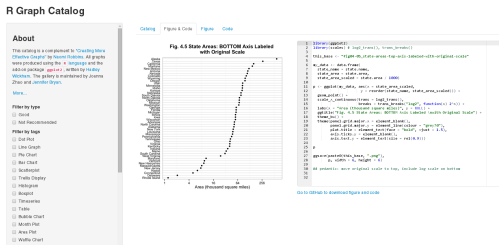
Joanna Zhao, an undergraduate researcher in the Department of Statistics at the University of British Columbia, produced a visual index of over 100 plots using ggplot2, the R package written by Hadley Wickham.

An example of a plot and its source R code on Joanna Zhao's catalogue.

An example of a plot and its source R code on Joanna Zhao’s catalog.

Click on a thumbnail of any picture in this catalog – you will see the figure AND all of the necessary code to reproduce it.  These plots are from Naomi Robbins‘ book “Creating More Effective Graphs”.

If you

  • want to produce an effective plot in R
  • roughly know what the plot should look like
  • but could really use an example to get started,

then this is a great resource for you!  A related GitHub repository has the code for ALL figures and the infrastructure for Joanna’s Shiny app.

I learned about this resource while working in my job at the British Columbia Cancer Agency; I am fortunate to attend a wonderful seminar series on statistics at the British Columbia Centre for Disease Control, and a colleague from this seminar told me about it.  By sharing this with you, I hope that it will immensely help you with your data visualization needs!

Useful Functions in R for Manipulating Text Data

Introduction

In my current job, I study HIV at the genetic and biochemical levels.  Thus, I often work with data involving the sequences of nucleotides or amino acids of various patient samples of HIV, and this type of work involves a lot of manipulating text.  (Strictly speaking, I analyze sequences of nucleotides from DNA that are reverse-transcribed from the HIV’s RNA.)  In this post, I describe some common functions in R that I often use for text processing.

Obtaining Basic Information about Character Variables

In R, I often work with text data in the form of character variables.  To check if a variable is a character variable, use the is.character() function.

> year = 2014
> is.character(year)
[1] FALSE

If a variable is not a character variable, you can convert it to a character variable using the as.character() function.

> year.char = as.character(year)
> is.character(year.char)
[1] TRUE

A basic piece of information about a character variable is the number of characters that exist in this string.  Use the nchar() function to obtain this information.

> nchar(year.char)
[1] 4

Read more of this post

Rectangular Integration (a.k.a. The Midpoint Rule) – Conceptual Foundations and a Statistical Application in R

Introduction

Continuing on the recently born series on numerical integration, this post will introduce rectangular integration.  I will describe the concept behind rectangular integration, show a function in R for how to do it, and use it to check that the Beta(2, 5) distribution actually integrates to 1 over its support set.  This post follows from my previous post on trapezoidal integration.

midpoint rule

Image courtesy of Qef from Wikimedia Commons.

Conceptual Background of Rectangular Integration (a.k.a. The Midpoint Rule)

Rectangular integration is a numerical integration technique that approximates the integral of a function with a rectangle.  It uses rectangles to approximate the area under the curve.  Here are its features:

  • The rectangle’s width is determined by the interval of integration.
    • One rectangle could span the width of the interval of integration and approximate the entire integral.
    • Alternatively, the interval of integration could be sub-divided into n smaller intervals of equal lengths, and n rectangles would used to approximate the integral; each smaller rectangle has the width of the smaller interval.
  • The rectangle’s height is the function’s value at the midpoint of its base.
  • Within a fixed interval of integration, the approximation becomes more accurate as more rectangles are used; each rectangle becomes narrower, and the height of the rectangle better captures the values of the function within that interval.

Read more of this post

Trapezoidal Integration – Conceptual Foundations and a Statistical Application in R

Introduction

Today, I will begin a series of posts on numerical integration, which has a wide range of applications in many fields, including statistics.  I will introduce trapezoidal integration by discussing its conceptual foundations, write my own R function to implement trapezoidal integration, and use it to check that the Beta(2, 5) probability density function actually integrates to 1 over its support set.  Fully commented and readily usable R code will be provided at the end.

beta pdf

Given a probability density function (PDF) and its support set as vectors in an array programming language like R, how do you integrate the PDF over its support set to ensure that it equals to 1?  Read the rest of this post to view my own R function to implement trapezoidal integration and learn how to use it to numerically approximate integrals.

Read more of this post

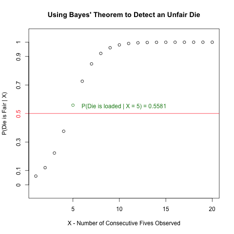
Detecting Unfair Dice in Casinos with Bayes’ Theorem

Introduction

I saw an interesting problem that requires Bayes’ Theorem and some simple R programming while reading a bioinformatics textbook.  I will discuss the math behind solving this problem in detail, and I will illustrate some very useful plotting functions to generate a plot from R that visualizes the solution effectively.

The Problem

The following question is a slightly modified version of Exercise #1.2 on Page 8 in “Biological Sequence Analysis” by Durbin, Eddy, Krogh and Mitchison.

An occasionally dishonest casino uses 2 types of dice.  Of its dice, 97% are fair but 3% are unfair, and a “five” comes up 35% of the time for these unfair dice.  If you pick a die randomly and roll it, how many “fives”  in a row would you need to see before it was most likely that you had picked an unfair die?”

Read more to learn how to create the following plot and how it invokes Bayes’ Theorem to solve the above problem!

unfair die plot

Read more of this post

Exploratory Data Analysis: Quantile-Quantile Plots for New York’s Ozone Pollution Data

Introduction

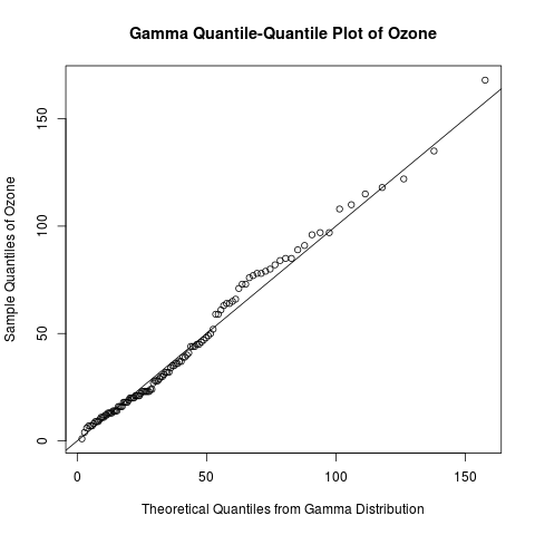
Continuing my recent series on exploratory data analysis, today’s post focuses on quantile-quantile (Q-Q) plots, which are very useful plots for assessing how closely a data set fits a particular distribution.  I will discuss how Q-Q plots are constructed and use Q-Q plots to assess the distribution of the “Ozone” data from the built-in “airquality” data set in R.

Previous posts in this series on EDA include

gamma qq-plot ozone

Learn how to create a quantile-quantile plot like this one with R code in the rest of this blog!

Read more of this post

Exploratory Data Analysis: Useful R Functions for Exploring a Data Frame

Introduction

Data in R are often stored in data frames, because they can store multiple types of data.  (In R, data frames are more general than matrices, because matrices can only store one type of data.)  Today’s post highlights some common functions in R that I like to use to explore a data frame before I conduct any statistical analysis.  I will use the built-in data set “InsectSprays” to illustrate these functions, because it contains categorical (character) and continuous (numeric) data, and that allows me to show different ways of exploring these 2 types of data.

If you have a favourite command for exploring data frames that is not in this post, please share it in the comments!

This post continues a recent series on exploratory data analysis.  Previous posts in this series include

Useful Functions for Exploring Data Frames

Use dim() to obtain the dimensions of the data frame (number of rows and number of columns).  The output is a vector.

> dim(InsectSprays)
[1] 72 2

Use nrow() and ncol() to get the number of rows and number of columns, respectively.  You can get the same information by extracting the first and second element of the output vector from dim(). 

> nrow(InsectSprays) 
# same as dim(InsectSprays)[1]
[1] 72
> ncol(InsectSprays)
# same as dim(InsectSprays)[2]
[1] 2

Read more of this post

Exploratory Data Analysis: The 5-Number Summary – Two Different Methods in R

Introduction

Continuing my recent series on exploratory data analysis (EDA), today’s post focuses on 5-number summaries, which were previously mentioned in the post on descriptive statistics in this series.  I will define and calculate the 5-number summary in 2 different ways that are commonly used in R.  (It turns out that different methods arise from the lack of universal agreement among statisticians on how to calculate quantiles.)  I will show that the fivenum() function uses a simpler and more interpretable method to calculate the 5-number summary than the summary() function.  This post expands on a recent comment that I made to correct an error in the post on box plots.

> y = seq(1, 11, by = 2)
> y
[1]  1  3  5  7  9 11
> fivenum(y)
[1]  1  3  6  9 11
> summary(y)
     Min.   1st Qu.   Median    Mean     3rd Qu.    Max. 
     1.0     3.5       6.0       6.0      8.5       11.0

Why do these 2 methods of calculating the 5–number summary in R give different results?  Read the rest of this post to find out the answer!

Previous posts in this series on EDA include

Read more of this post